
Instagram post sizes can make the difference between content that looks polished and content that gets awkwardly cropped, compressed, or buried in the feed.
If you're wondering what the best Instagram post size is in 2026, the answer depends on whether you're publishing a feed image, carousel, Story, or Reel. In this guide, you'll learn the exact dimensions and aspect ratios to use—and how Bibby can help you turn those correctly sized visuals into automatically captioned and scheduled content across your social channels.
In this blog, you will look into:
- The ideal dimensions for every major Instagram format.
- How to avoid common sizing and cropping mistakes.
- How Bibby automates your social media publishing workflow.
Once you know the right dimensions, the next step is making sure your content gets published consistently.
What Is the Best Instagram Post Size in 2026?
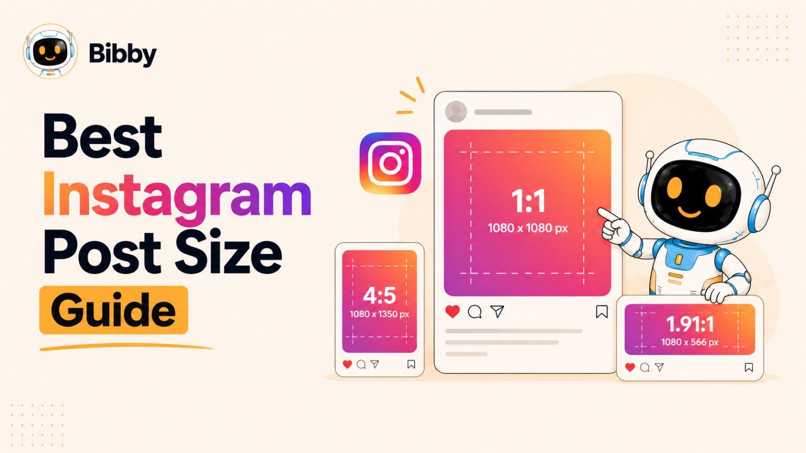
The best Instagram post size in 2026 depends on the type of content you're publishing. For standard feed images, a 1080 × 1350 pixel portrait image with a 4:5 aspect ratio is generally the strongest default because it takes up more vertical space in the mobile feed than a square or landscape image.
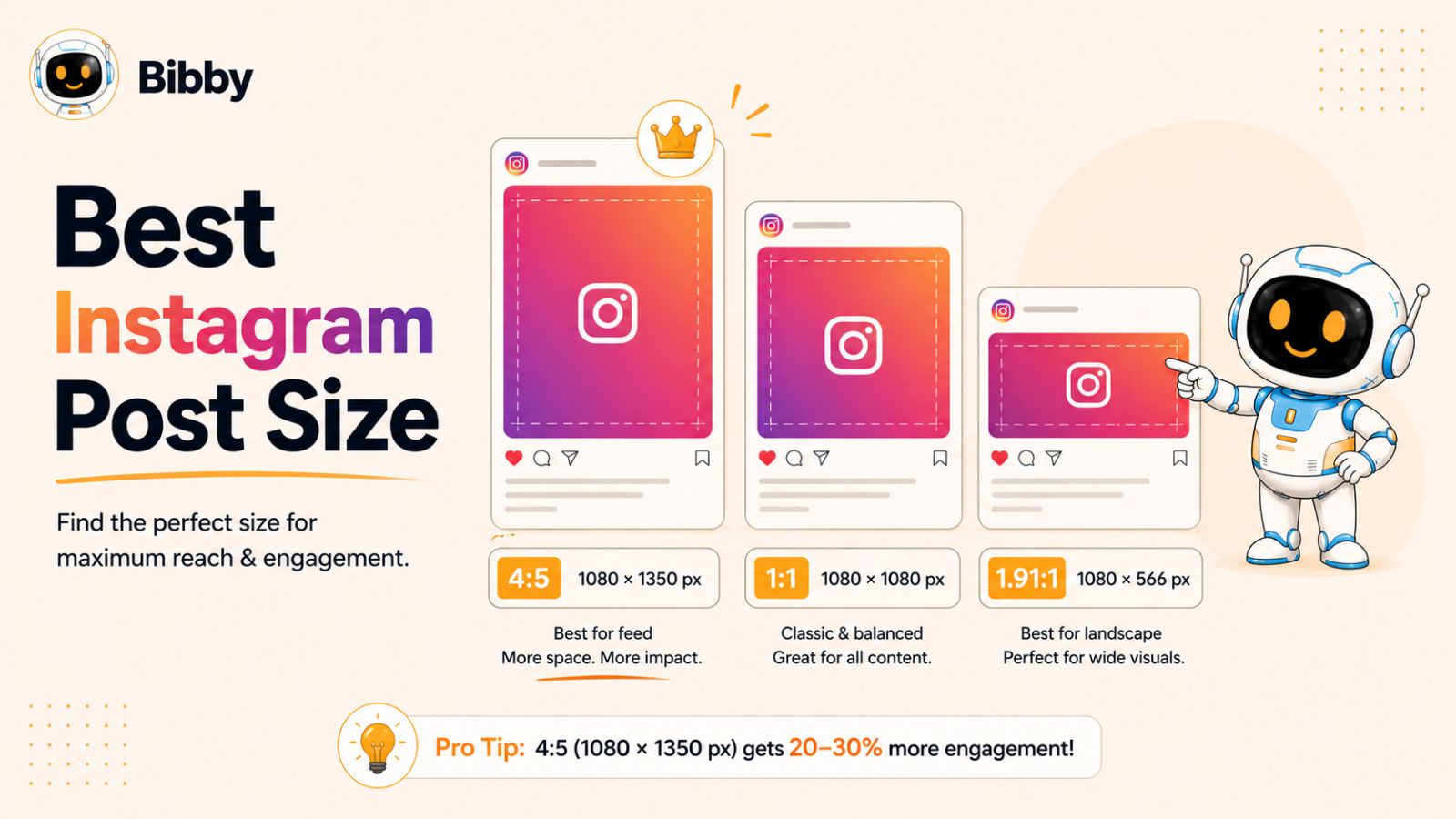
For other Instagram formats, the recommended dimensions differ:
| Instagram format | Recommended size | Aspect ratio |
|---|---|---|
| Feed portrait post | 1080 × 1350 px | 4:5 |
| Feed square post | 1080 × 1080 px | 1:1 |
| Feed landscape post | 1080 × 566 px | ~1.91:1 |
| Carousel post | 1080 × 1350 px | 4:5 |
| Instagram Story | 1080 × 1920 px | 9:16 |
| Instagram Reel | 1080 × 1920 px | 9:16 |
| Profile picture | 1080 × 1080 px recommended source | 1:1 |
Why 1080 × 1350 Is the Best Default for Instagram Feed Posts
If you're creating a conventional Instagram feed post and don't have a specific reason to use another format, 1080 × 1350 pixels (4:5) is an excellent starting point.
The biggest advantage is screen real estate. A 4:5 portrait image occupies substantially more vertical space on a smartphone than a 1:1 square image. That gives your visual more opportunity to capture attention while someone is scrolling.
This doesn't mean every piece of content should be forced into 4:5. A landscape photograph, infographic, product image, or existing creative may work better in another proportion. The goal is to choose the format that presents the content effectively—not to sacrifice the composition simply to hit a particular number.
Instagram Image Quality Matters Too
Dimensions are only part of the equation. Starting with a sufficiently high-resolution image helps preserve clarity when Instagram processes and displays the content.
For most Instagram graphics, 1080 pixels wide is a practical working standard. When preparing your creative, export it at the intended aspect ratio rather than taking a smaller image and stretching it to fit.
You should also keep important text, logos, faces, and other essential elements away from the edges of the design. Even when an image technically has the correct dimensions, poor placement can make the content feel cramped or cause important elements to interact awkwardly with Instagram's interface.
The Right Instagram Size Depends on the Content
There isn't one universal Instagram dimension that is perfect for every format.
Use 4:5 portrait for most feed-first image posts when you want to maximize vertical space. Use 1:1 square when the square composition genuinely suits your design or when you're working with existing square assets. Use 9:16 vertical for full-screen Stories and Reels.
This distinction becomes particularly important for businesses publishing frequently. Creating every post manually in multiple dimensions can quickly turn social media management into a repetitive production task.
That's where a workflow such as Bibby can help. Instead of treating content creation, caption writing, and scheduling as separate jobs, Bibby brings them into one workflow: upload your image or generate one with AI, choose your posting style, let Bibby automatically generate the caption, and schedule your content across your selected platforms at AI-optimized times.
You can use the workflow for images, carousels, videos, and Stories, while managing content for Instagram alongside platforms such as Facebook, LinkedIn, YouTube, and TikTok. Bibby also includes a chat interface where you can manage tasks conversationally, including creating a brand kit, creating campaigns and posts, and regenerating captions.
The result is a shift from simply knowing the correct Instagram dimensions to having a repeatable system for turning properly prepared creative into consistently published social content.
Key takeaway: For most Instagram feed images, start with 1080 × 1350 pixels at 4:5. For Stories and Reels, think 1080 × 1920 pixels at 9:16. Then build your publishing workflow around the format that best fits the content rather than forcing every asset into the same dimensions.
Instagram Post Dimensions at a Glance
Instagram supports several content formats, and each one has different dimensions and aspect-ratio requirements. Choosing the right format before you design your content helps prevent unwanted cropping, awkward framing, and blurry exports.
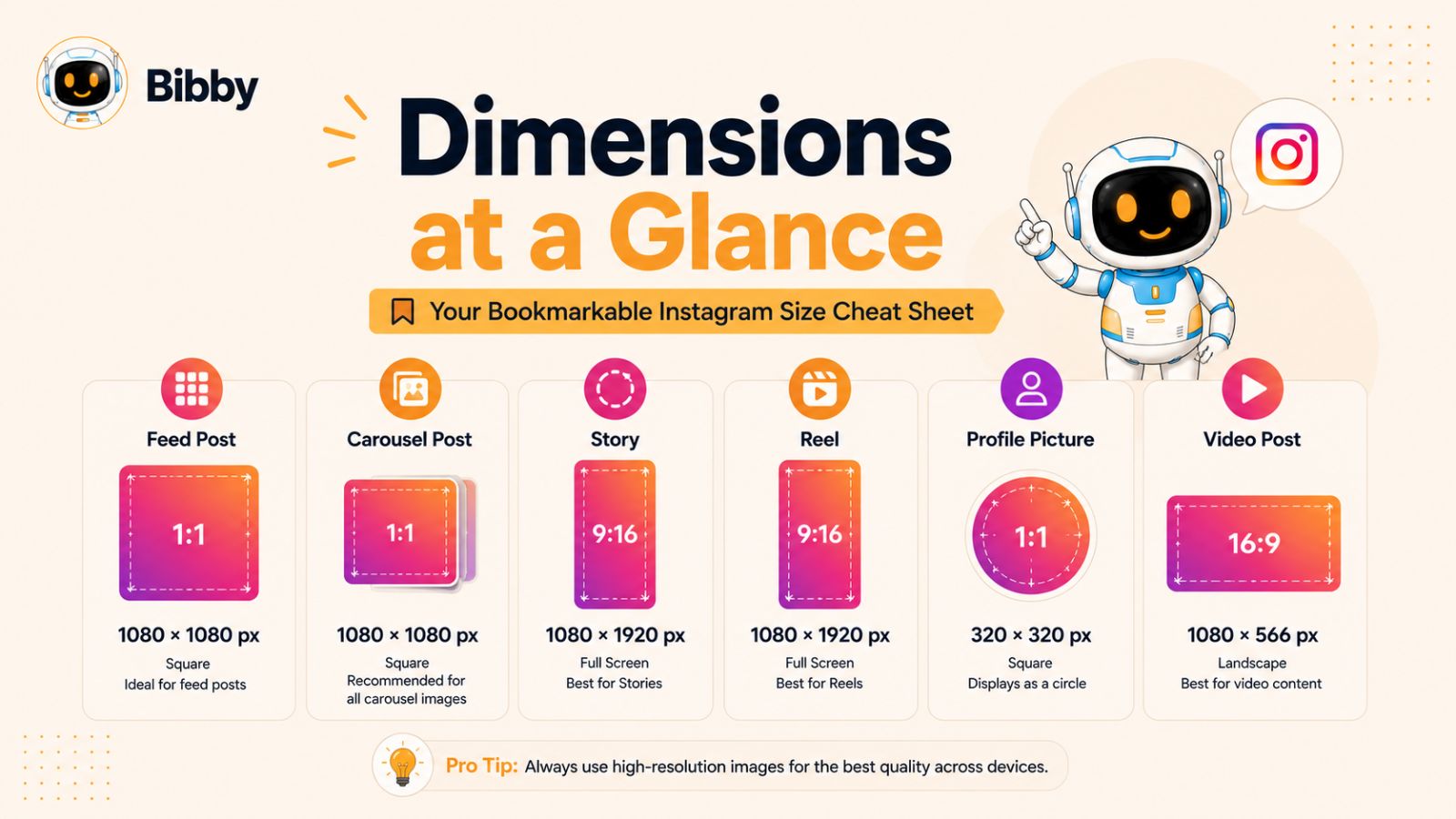
For most creators and businesses, the easiest approach is to keep a small set of dimensions on hand rather than trying to remember every Instagram specification.
Instagram Dimensions Cheat Sheet
| Content type | Recommended dimensions | Aspect ratio | Best use |
|---|---|---|---|
| Portrait feed post | 1080 × 1350 px | 4:5 | Most feed images |
| Square feed post | 1080 × 1080 px | 1:1 | Square graphics and photos |
| Landscape feed post | 1080 × 566 px | ~1.91:1 | Wide photography and visuals |
| Carousel | 1080 × 1350 px | 4:5 | Multi-slide educational or promotional content |
| Story | 1080 × 1920 px | 9:16 | Full-screen temporary content |
| Reel | 1080 × 1920 px | 9:16 | Short-form vertical video |
| Profile picture | 1080 × 1080 px source | 1:1 | Profile images and logos |
These dimensions are practical production targets rather than a reason to obsess over individual pixels. Instagram can accommodate different image proportions, but preparing your creative at an appropriate size and aspect ratio gives you much more control over how it appears.
Portrait: 1080 × 1350 Pixels
For standard feed content, 1080 × 1350 pixels at 4:5 is a strong default.
The portrait format is particularly useful for educational graphics, quotes, product photography, announcements, and other content where vertical space helps communicate the message.
Square: 1080 × 1080 Pixels
The 1080 × 1080 pixel square format remains useful, particularly when your design is naturally symmetrical or you already have a library of square creative.
It's also convenient for maintaining a consistent visual system across certain types of branded content.
Landscape: Approximately 1080 × 566 Pixels
Landscape posts are useful when the composition depends on width—for example, panoramic photography, certain product shots, or images where cropping to portrait would remove important information.
However, because landscape images occupy less vertical space in the feed, they're usually not the first choice when your primary objective is maximizing the amount of screen space your post receives.
Stories and Reels: 1080 × 1920 Pixels
For full-screen vertical content, 1080 × 1920 pixels with a 9:16 aspect ratio is the standard target.
This format works for both Instagram Stories and Reels, although the content itself should be designed differently. Stories are often more immediate and interactive, while Reels are generally designed around short-form video discovery and engagement.
Remember that Instagram's interface occupies portions of the screen. Keep critical text, logos, calls to action, and other important information within a comfortable central safe area instead of placing them directly against the edges.
Don't Confuse Dimensions With Aspect Ratio
These two concepts are closely related but aren't identical.
Dimensions describe the actual pixel size of an image—for example, 1080 × 1350 pixels.
Aspect ratio describes the relationship between its width and height—in this case, 4:5.
Understanding both is useful because you can create the same composition at different resolutions while preserving its aspect ratio. For example, an image can maintain a 4:5 composition at different pixel dimensions, but the larger source may provide more flexibility during production.
A Simple Rule for Creating Instagram Content
If you want a straightforward production system, start with three primary templates:
- 1080 × 1350 for feed images and carousels
- 1080 × 1920 for Stories and Reels
- 1080 × 1080 when square creative genuinely suits the content
This reduces unnecessary design decisions while still covering the formats most brands use regularly.
And if you're publishing content across multiple platforms, the challenge quickly becomes bigger than Instagram dimensions. You may need different creative formats, captions, publishing dates, and schedules for each network.
That's one reason an automated workflow can be valuable. With Bibby, you can upload your media or generate visuals with AI, choose a posting style, have captions generated automatically, and schedule content across Instagram, Facebook, LinkedIn, YouTube, and TikTok. You can also publish images, carousels, videos, and Stories from the same workflow.
The objective isn't simply to know the right Instagram dimensions. It's to make using those dimensions part of a repeatable content-production system.
Also read: Social Media Growth With AI: The New Rules Every Brand Must Know
Best Instagram Portrait Post Size in 2026
For most Instagram feed posts, 1080 × 1350 pixels with a 4:5 aspect ratio is the best portrait format to use in 2026. It gives your content more vertical space in the mobile feed than a square image while remaining within Instagram's standard portrait proportions.
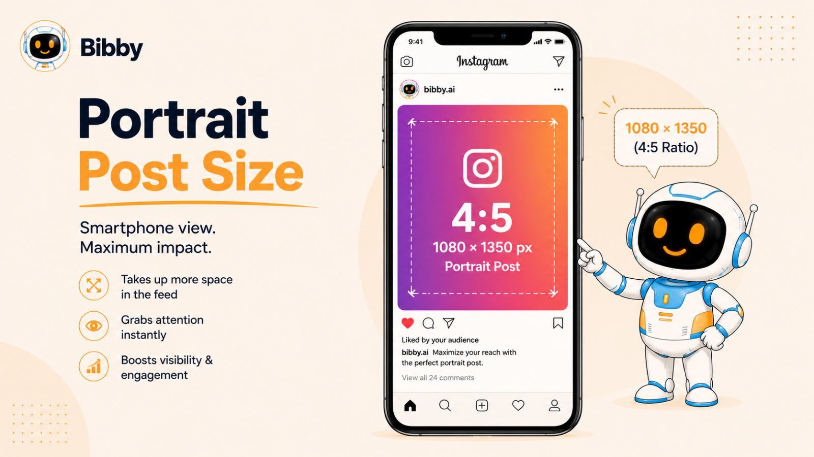
Portrait posts are especially effective when your content benefits from a tall composition. Product photography, educational graphics, step-by-step tutorials, promotional announcements, quotes, and branded visuals can all work well in this format.
Why Use a 4:5 Instagram Post?
The main advantage of a portrait post is simple: it takes up more of the viewer's screen while they scroll.
Compare a 1080 × 1080 square post with a 1080 × 1350 portrait post. Both have the same width, but the portrait version is 270 pixels taller. On a phone, that additional vertical space can make the visual more prominent and give you more room to communicate your message.
That extra space is particularly useful for content where visual hierarchy matters. You can create a clear headline, supporting information, imagery, and branding without squeezing everything into a square canvas.
However, more space doesn't automatically mean better content. A poorly designed portrait graphic can still be ignored. The dimensions should support your message rather than determine it.
What Should You Put in a Portrait Instagram Post?
The best use of the 4:5 format depends on your content strategy, but common applications include:
- Educational infographics
- Product announcements
- Product photography
- Customer testimonials
- Statistics and data visualizations
- Quotes and thought leadership
- Promotional offers
- Event announcements
- Step-by-step tutorials
- Branded editorial content
For text-heavy designs, use a strong visual hierarchy. Your most important message should be immediately understandable, while secondary information can support the main idea without competing with it.
Keep Important Elements Away From the Edges
Correct dimensions won't protect your content from poor placement.
When designing a portrait post, avoid placing essential text, logos, or visual details directly against the outer edges. Give important elements enough breathing room that the composition remains comfortable if the platform displays or crops the asset differently.
This is particularly important when you're creating content intended for more than one placement. A design that looks perfect in an Instagram feed may need to be adapted before being used as a Story, Reel cover, advertisement, or another platform's creative.
Don't Stretch Smaller Images to 1080 × 1350
One common mistake is taking a low-resolution image and simply enlarging it to the recommended dimensions.
Increasing the pixel dimensions doesn't create missing image detail. If the original asset is too small, scaling it up can produce softness, visible pixelation, or compression artifacts.
Whenever possible, start with a high-quality original and crop it to the 4:5 composition. If you're creating graphics from scratch, build the design at the intended dimensions from the beginning.
Portrait Posts and Social Media Automation
A strong visual is only the first step. If you're managing a business account, you also need to write captions, maintain a publishing schedule, repurpose content, and publish consistently.
Bibby is designed to bring those tasks into one social media workflow. You can upload your finished portrait image or generate an image with AI, choose your preferred posting style, and have Bibby automatically generate a caption. You can then schedule the content across your selected social platforms at AI-optimized times.
That means a correctly sized Instagram post doesn't have to remain an isolated piece of content. The same workflow can support Instagram, Facebook, LinkedIn, YouTube, and TikTok, with support for images, carousels, videos, and Stories.
Bibby's chat interface adds another layer of convenience. Instead of manually navigating through every task, you can interact with the tool conversationally to create a brand kit, build a campaign, create posts, regenerate captions, and manage other social media tasks.
Best Practice for 2026
If you're unsure which Instagram feed format to choose, 1080 × 1350 pixels at 4:5 is a reliable default for portrait content.
Prioritize the quality and composition of the original creative, keep important elements comfortably inside the frame, and design around the viewer's mobile experience. Then use a consistent publishing workflow to make sure those assets actually reach your audience.
Best Instagram Square Post Size in 2026
The recommended Instagram square post size is 1080 × 1080 pixels, using a 1:1 aspect ratio. While portrait posts are often a better default for maximizing vertical feed space, square posts remain a practical option when the composition naturally works in a symmetrical format.
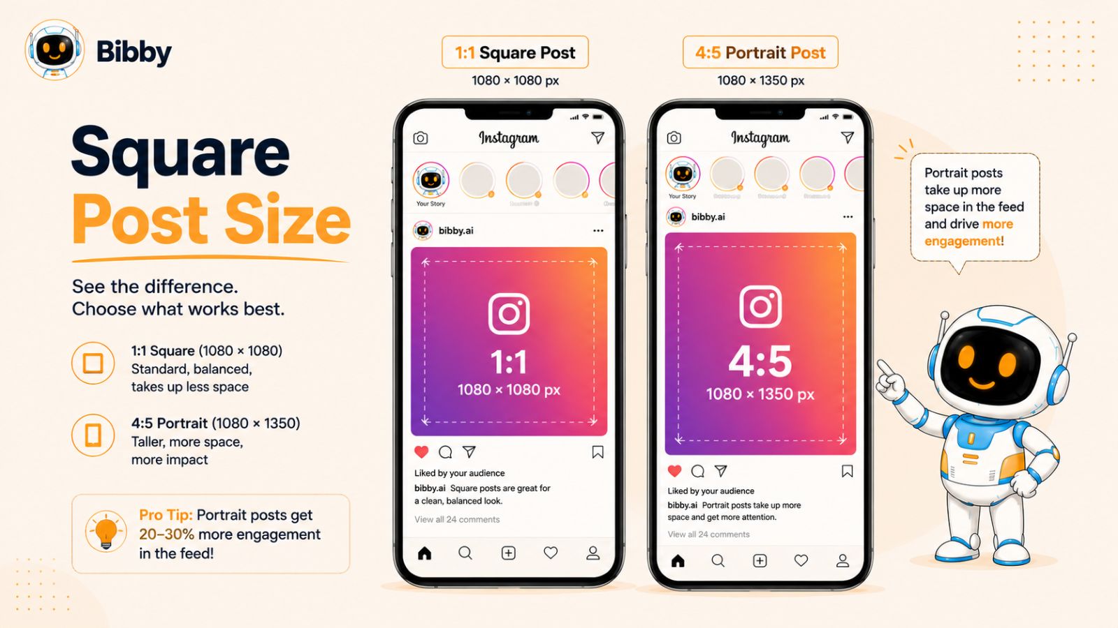
Square images are particularly useful for product photography, simple branded graphics, logos, announcements, and content designed around a centered visual.
Why Does Instagram Still Support Square Posts?
Square was one of Instagram's defining visual formats for years, so many creators and brands already have large libraries of 1:1 content.
The format also has a practical advantage: it is predictable. A square canvas gives you equal width and height, making it relatively straightforward to build templates with centered subjects, consistent margins, and repeatable branding.
If your existing content library is primarily square, there's no need to rebuild every asset simply because portrait posts can occupy more feed space. A well-designed square post is more valuable than a poorly cropped portrait post.
When Should You Use a Square Instagram Post?
A 1:1 format can work particularly well for:
- Product images with centered compositions
- Brand announcements
- Quotes and short statements
- Simple promotional graphics
- Logo-focused designs
- Album or collection artwork
- User-generated content that is already square
- Consistent branded templates
For example, a product photographed against a clean background may look perfectly balanced in a square canvas. Cropping that same image into 4:5 could add unnecessary space or remove part of the product.
The best format should therefore be determined by the visual and the communication goal—not simply by following a universal rule.
Square vs. Portrait Instagram Posts
The biggest practical difference is the amount of vertical space each format occupies.
A 1080 × 1080 square image has a 1:1 ratio, while a 1080 × 1350 portrait image has a 4:5 ratio. Both can be displayed effectively in the Instagram feed, but the portrait version is taller.
That makes portrait a useful default when you want to maximize the amount of screen real estate your content occupies. Square can be preferable when maintaining the original composition is more important.
A useful rule is:
Use 4:5 when vertical space improves the content; use 1:1 when the square composition is genuinely better.
Design Tips for Square Instagram Posts
A square canvas gives you less vertical room than a portrait post, so keep the design focused.
Start with one primary message or visual. Use clear typography, sufficient contrast, and consistent spacing. If you're adding a logo or call to action, make sure it supports the primary message rather than competing with it.
For text-heavy content, avoid filling every available pixel. White space can make a square graphic significantly easier to understand while scrolling.
If you're creating a series of square posts, establish consistent rules for fonts, colors, margins, imagery, and logo placement. This creates visual recognition even before someone reads the caption.
Should You Convert Every Square Post to 4:5?
No.
If a square asset already performs well visually and communicates its message effectively, changing its dimensions isn't automatically an improvement.
Instead, consider whether the content can be recomposed rather than simply stretched or cropped. A square product image may need a completely different composition to work well as a portrait post.
This is especially important for businesses managing large content libraries. Automatically resizing every image without considering its focal point can produce inconsistent or unattractive results.
Make Square Content Part of an Automated Workflow
Creating the image is only one part of maintaining an active social media presence. Once you have a collection of square graphics, you still need to write captions, decide when to publish them, and distribute the content consistently.
With Bibby, you can upload your existing square images or generate new visuals with AI, select your posting style, and let Bibby generate captions automatically. You can then schedule your posts at AI-optimized times across selected platforms, including Instagram, Facebook, LinkedIn, YouTube, and TikTok.
Bibby also supports images, carousels, videos, and Stories, so your social workflow doesn't have to stop at square Instagram posts. Its chat interface lets you manage social media tasks conversationally, including creating a brand kit, launching campaigns, creating posts, and regenerating captions.
The goal is to turn individual pieces of creative into a repeatable publishing system.
Best Instagram Landscape Post Size in 2026
The recommended Instagram landscape post size is 1080 × 566 pixels, using an aspect ratio of approximately 1.91:1. Landscape posts are useful when the composition depends on horizontal space, but they generally occupy less vertical space in the Instagram feed than portrait posts.
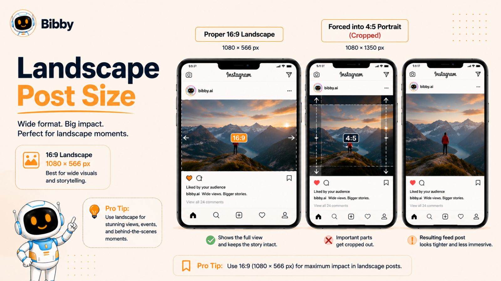
That makes landscape a more specialized format. It isn't necessarily the best choice for every feed post, but it can be the right choice when cropping the image into a portrait or square format would damage the composition.
When Should You Use a Landscape Instagram Post?
Landscape images work particularly well when width is an important part of the visual.
Common examples include:
- Wide landscape photography
- Travel photography
- Group photographs
- Architectural images
- Panoramic compositions
- Certain product photographs
- Images containing multiple subjects arranged horizontally
- Visuals originally created for wider formats
Imagine a photograph of a mountain range stretching across the horizon. Cropping that image aggressively into a 4:5 portrait frame could remove much of the scene that makes the photograph effective.
In that situation, keeping the landscape composition can be more important than maximizing feed height.
Landscape vs. Portrait Instagram Posts
The main trade-off is composition versus screen real estate.
A 4:5 portrait post takes up considerably more vertical space in the feed. A landscape image is much wider relative to its height, so it occupies less of the viewer's screen.
For content designed primarily to stop scrolling, portrait is often the stronger default. For photography and visual storytelling where the horizontal composition is essential, landscape can be the better choice.
There's no reason to force every image into portrait if doing so makes the actual content worse.
Don't Crop Important Subjects Just to Match 4:5
One of the most common mistakes when adapting landscape images is treating resizing as a purely technical exercise.
Suppose you have a wide photograph containing three people. Converting it to 4:5 by automatically cropping from both sides could cut out one of the people or eliminate important context.
Instead, consider recomposing the asset. You might reposition the image within a larger design, adjust the crop manually, or create a new version specifically for Instagram.
The objective isn't to hit a pixel specification at any cost. The objective is to produce an image that looks intentional on the platform.
Design Considerations for Landscape Posts
Because landscape posts have less vertical space, simplicity becomes especially important.
Avoid placing tiny text across a wide image. Text that is readable on a desktop monitor may become difficult to read when viewed on a smartphone.
If text is essential, consider using a larger type size, stronger contrast, and fewer words. Let the image communicate as much of the message as possible.
You should also preview the post on an actual mobile screen before publishing important campaign creative. A technically correct image can still fail from a usability perspective.
Can You Use Landscape Content Across Other Platforms?
Yes, but the ideal format varies significantly between platforms and placements.
A landscape image may be appropriate for an Instagram feed post while requiring a different composition for a Story, Reel, TikTok video, or another social placement. Rather than expecting one asset to look perfect everywhere, create adaptable versions when the content justifies the additional work.
This is one reason a centralized social media workflow can be valuable.
With Bibby, you can upload your existing creative or generate images with AI, choose a posting style, automatically generate captions, and schedule your content across selected platforms. Instead of managing each network separately, you can organize content for Instagram, Facebook, LinkedIn, YouTube, and TikTok through the same workflow.
Bibby supports images, carousels, videos, and Stories, while its chat interface lets you manage tasks conversationally. You can use the chat experience to create a brand kit, create campaigns, create posts, regenerate captions, and handle other social media management tasks.
That makes it easier to treat your social presence as one connected content system rather than a collection of disconnected uploads.
Also read: Social Media Automation for Franchises and Multi-Location Businesses: The Complete Guide (2026)
Best Instagram Carousel Size in 2026
For most Instagram carousels, 1080 × 1350 pixels with a 4:5 aspect ratio is a strong choice in 2026. The same format can be used across every slide, giving the carousel a consistent appearance while maximizing vertical space in the feed.
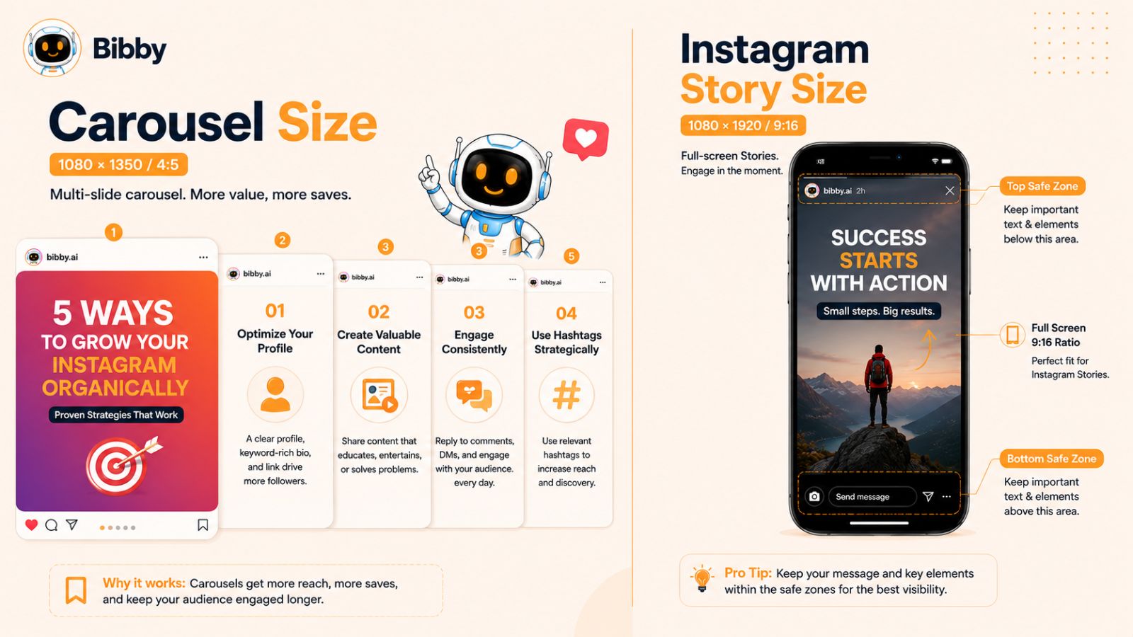
Carousels are especially valuable when a single image isn't enough to communicate the complete idea. You can use multiple slides to explain a concept, showcase a product, tell a story, present a tutorial, or break down a complex topic into smaller pieces.
What Is an Instagram Carousel?
An Instagram carousel allows you to publish multiple pieces of media within a single feed post. Users can swipe through the slides rather than seeing the content as separate posts.
A carousel can contain:
- Multiple photographs
- Educational graphics
- Step-by-step instructions
- Product images
- Customer testimonials
- Data and statistics
- Before-and-after comparisons
- Promotional slides
- Short-form visual storytelling
The format gives brands more room to develop an idea without requiring the audience to leave the post.
What Size Should an Instagram Carousel Be?
For a portrait carousel, use:
1080 × 1350 pixels — 4:5 aspect ratio
The most important rule is consistency. Keep every slide in the same aspect ratio and orientation.
If one slide is portrait, another is square, and another is landscape, the carousel experience can become inconsistent. Designing all slides on the same canvas makes the sequence look intentional and professional.
For most educational and branded carousels, a 4:5 canvas provides enough room for headlines, supporting copy, illustrations, photography, and branding without making the design feel excessively cramped.
Why Consistency Matters in a Carousel
A carousel should feel like one piece of content rather than several unrelated images placed together.
Use consistent:
- Dimensions
- Margins
- Typography
- Color palette
- Image treatment
- Brand elements
- Visual hierarchy
Consistency helps users understand that each slide belongs to the same story.
It also makes production easier. Once you establish a reusable carousel template, your team can create new educational or promotional content without redesigning the entire visual system every time.
Make the First Slide Your Hook
The first slide has an especially important job: convince someone to stop and swipe.
Instead of trying to explain the entire topic immediately, use the opening slide to create a clear reason to continue.
For example, a carousel about Instagram dimensions could begin with:
“Using the wrong Instagram size? Here's the 2026 cheat sheet.”
The remaining slides can then provide the dimensions, examples, mistakes, and recommendations.
Keep the first slide visually simple. One strong headline and one clear visual idea will often be more effective than filling the canvas with information.
Build a Logical Slide Sequence
A strong carousel should have a beginning, middle, and end.
A useful structure is:
- Hook — introduce the problem or promise.
- Context — explain why it matters.
- Value — provide the information or solution.
- Examples — make the information practical.
- Takeaway — summarize the main lesson.
- CTA — give the reader a logical next action.
You don't need to use six slides every time. The appropriate length depends on the subject. The important thing is that every slide earns its place.
Avoid Putting Too Much Text on Each Slide
Carousels are consumed on mobile devices, so readability matters.
Avoid turning every slide into a miniature blog post. Use short headlines, concise supporting copy, visual cues, and enough spacing to make the information easy to scan.
If the subject requires significant explanation, use the caption to provide additional context rather than trying to fit everything into the graphic.
How Bibby Makes Carousel Publishing Easier
Creating a carousel is only part of the social media workflow. Once you've designed the slides, you still need to create a caption, decide when to publish, and potentially distribute related content across multiple platforms.
Bibby brings these tasks together.
You can upload your carousel or generate visual content with AI, choose your posting style, and let Bibby automatically generate the caption. From there, you can schedule the content at AI-optimized times across your selected social platforms.
Bibby supports Instagram, Facebook, LinkedIn, YouTube, and TikTok, allowing you to manage your broader social publishing workflow from one place.
It also supports different media types, including images, carousels, videos, and Stories. And with Bibby's chat interface, you can manage social media through conversation—for example, creating a brand kit, creating a campaign, creating posts, or regenerating captions.
This is particularly useful for businesses that publish regularly and don't want carousel creation to become another manual task in an already crowded content workflow.
Instagram Story Size and Dimensions in 2026
The recommended Instagram Story size is 1080 × 1920 pixels, with a 9:16 aspect ratio. This vertical format is designed to fill the smartphone screen and is the standard starting point for creating full-screen Instagram Stories.
Stories are different from regular feed posts because they are designed for an immersive, vertical viewing experience. That makes composition, text placement, and the location of interactive elements particularly important.
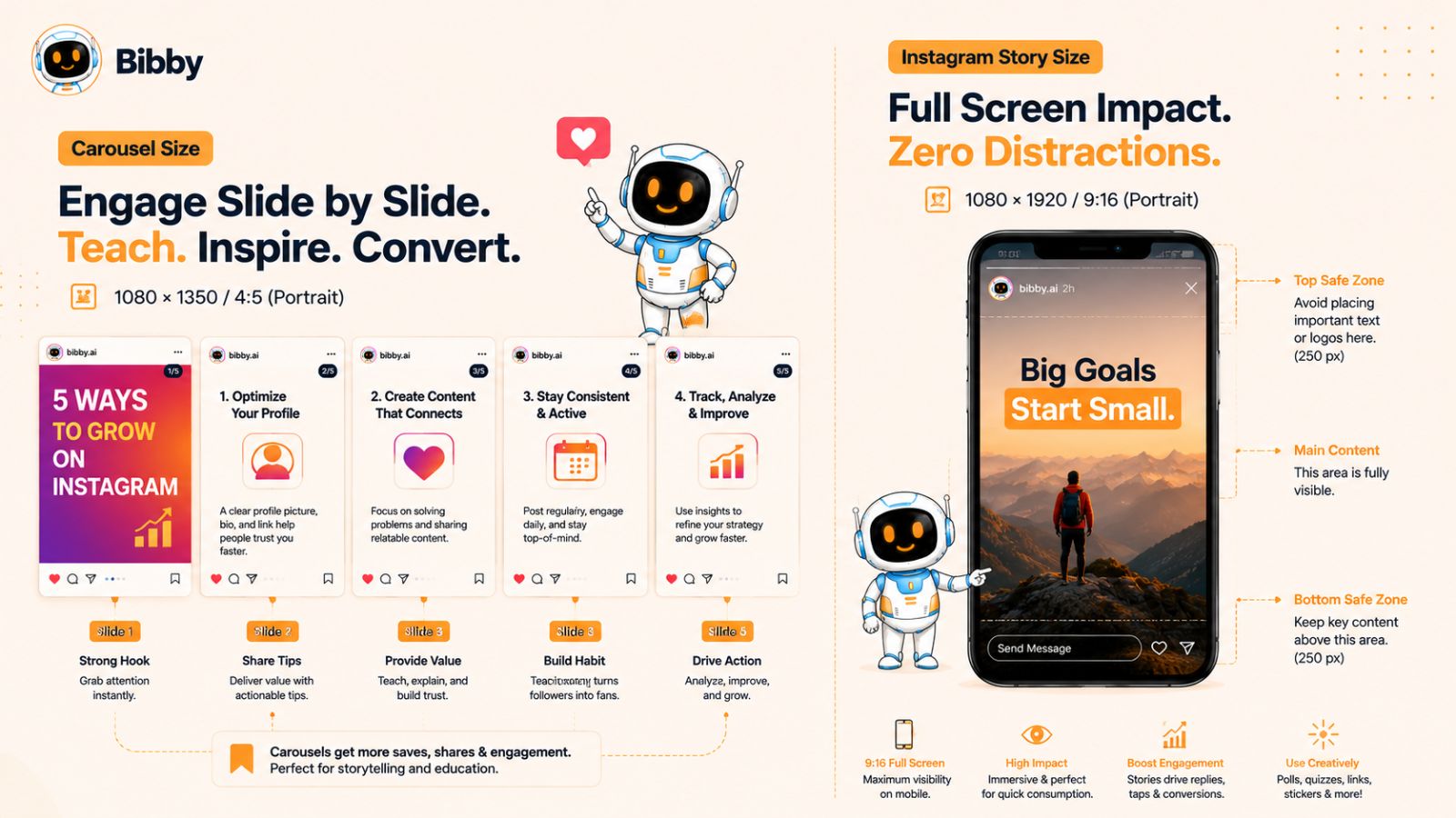
What Size Should an Instagram Story Be?
For most Instagram Stories, use:
1080 × 1920 pixels — 9:16 aspect ratio
This format works for both static images and vertical video.
When creating a Story from scratch, start with a 1080 × 1920 canvas rather than designing a smaller asset and enlarging it later. This gives you greater control over image quality and makes it easier to position text and other visual elements precisely.
Why Is 9:16 the Best Instagram Story Format?
A 9:16 image or video is tall enough to fill the typical smartphone display in portrait orientation.
Unlike a feed post, a Story isn't competing with other posts above and below it in the same scrolling feed. The content occupies the viewer's screen, so your creative needs to work as a vertical, full-screen composition.
This makes 9:16 particularly effective for:
- Product demonstrations
- Behind-the-scenes content
- Announcements
- Limited-time promotions
- Tutorials
- Customer testimonials
- Polls and questions
- Event coverage
- Vertical photography
- Short videos
Keep Important Content Inside the Safe Area
Getting the dimensions right isn't enough.
Instagram's interface can overlay elements on top of your Story, including navigation controls, account information, interactive stickers, and other interface components. If your headline, logo, price, or call to action sits too close to the top or bottom, it may become difficult to see.
A safer approach is to keep critical information toward the central portion of the canvas, leaving comfortable margins around the edges.
This is especially important for branded content. A beautiful Story can lose its effectiveness if the call to action is partially obscured by the platform interface.
Don't Treat Stories Like Vertical Feed Posts
Although both formats are visual, their communication styles can be very different.
A feed post often needs to make sense as a standalone piece of content. A Story can be part of a sequence.
For example, a brand could use four Stories to introduce a new product:
- Story 1: Introduce the problem.
- Story 2: Reveal the product.
- Story 3: Show how it works.
- Story 4: Invite viewers to take action.
This sequence can create a more natural narrative than attempting to communicate everything on one static image.
Images vs. Videos in Instagram Stories
The 9:16 format works for both.
For static images, focus on strong composition, readable text, and a clear visual hierarchy. For video, pay additional attention to movement, framing, audio, subtitles, and the first few seconds of the clip.
If you're repurposing horizontal video, don't simply stretch it to fill the screen. Reframe the footage so the important subject remains visible in the vertical composition.
Common Instagram Story Size Mistakes
Avoid these common problems:
Using landscape creative without adapting it.
A horizontal image can leave large empty areas or require aggressive cropping when placed into a 9:16 canvas.
Putting text against the edges.
Important information can compete with Instagram's interface elements.
Using low-resolution images.
Starting with a small source and enlarging it can make the final Story appear soft.
Overloading one Story.
Trying to communicate five different ideas on one screen can make the content difficult to understand.
Ignoring mobile readability.
Always consider how the design looks on an actual smartphone rather than relying only on a desktop design preview.
Create and Schedule Instagram Stories With Bibby
For businesses that publish Stories frequently, creating the content is only half the job. You also need to prepare captions or supporting copy where appropriate, organize your publishing calendar, and keep your content consistent.
Bibby can streamline that workflow.
You can upload your media or generate an image with AI, choose your posting style, and let Bibby generate captions automatically. You can then schedule your social content at AI-optimized times across the platforms you've selected.
Bibby supports Instagram Stories alongside images, carousels, and videos, and lets you manage content across Instagram, Facebook, LinkedIn, YouTube, and TikTok from the same social media workflow.
You can also use Bibby's chat interface to manage your social media conversationally. For example, you can ask Bibby to create a brand kit, create a campaign, create posts, or regenerate captions without having to manage every task separately.
That turns Story publishing from a recurring manual chore into part of a broader automated content system.
Best Instagram Reel Size and Dimensions in 2026
The recommended Instagram Reel size is 1080 × 1920 pixels, using a 9:16 aspect ratio. This full-screen vertical format is designed for mobile viewing and gives your video the space it needs to fill the screen without unnecessary borders or cropping.
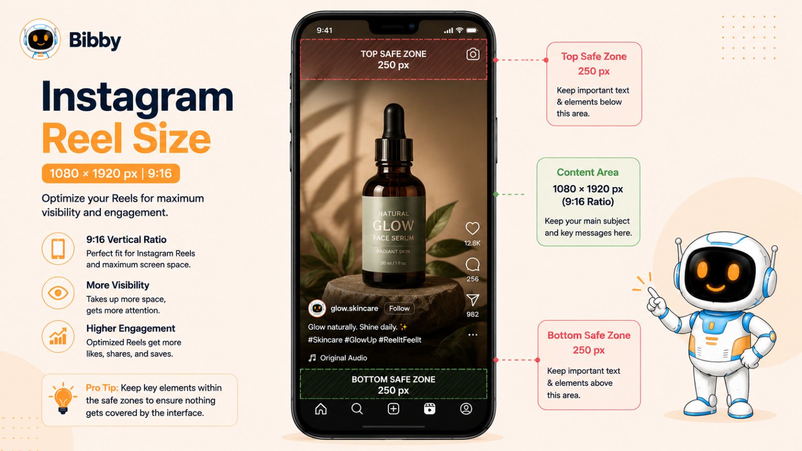
For creators and brands investing in short-form video, getting the dimensions right is important—but it's only one part of creating an effective Reel. Framing, text placement, video quality, cover design, and the opening seconds all influence how professional and usable the final content feels.
What Size Should an Instagram Reel Be?
For a standard vertical Reel, use:
1080 × 1920 pixels — 9:16 aspect ratio
This gives you a Full HD vertical canvas suitable for most mobile-first video production.
If you're recording directly on a modern smartphone, you can often capture footage at a higher resolution and then export an appropriately sized version for publishing. Keeping a high-quality original is useful because it gives you flexibility when editing, cropping, and repurposing the footage.
Why Is 9:16 the Best Format for Reels?
Reels are designed around vertical, full-screen consumption.
When someone watches a Reel, the video occupies the majority of their smartphone display. A properly framed 9:16 video therefore feels native to the experience, while a horizontal video placed inside a vertical canvas can create empty space or require aggressive cropping.
Vertical video is particularly useful for:
- Tutorials and how-to videos
- Product demonstrations
- Behind-the-scenes footage
- Interviews
- Educational videos
- Customer testimonials
- Short promotional videos
- Creator-led content
- Quick tips and explanations
Keep Text and Important Visuals in Safe Areas
One of the easiest mistakes to make with Reels is placing important information too close to the edges.
Instagram's interface can appear over portions of the video. Depending on where your content is displayed, elements such as the caption area, account information, engagement controls, and other interface components can compete with your design.
For that reason, keep essential:
- Headlines
- Subtitles
- Logos
- Product information
- Calls to action
comfortably inside the central portion of the frame.
Don't design your Reel as though every pixel of the 1080 × 1920 canvas will always be unobstructed.
What About Instagram Reel Covers?
Your Reel cover deserves separate attention because the cover may appear in different contexts from the full-screen Reel itself.
A cover can be designed as a compelling thumbnail that clearly communicates what the video is about. But important information should be positioned so it remains understandable when the cover is displayed in different areas of Instagram.
Avoid making the cover dependent on tiny text or details that disappear when the image is shown as a smaller thumbnail.
A strong Reel cover should make the topic immediately obvious and visually consistent with the rest of your brand.
Don't Upload a Horizontal Video and Call It Done
If your original footage is 16:9 landscape video, simply placing it inside a 9:16 frame may not produce the best result.
You have several options:
- Reframe the footage around the main subject.
- Crop the original video strategically.
- Use a designed background when appropriate.
- Record a dedicated vertical version.
- Create multiple compositions for different platforms.
The correct approach depends on the footage. If cropping removes important information, a new composition may be better than forcing the existing video into a vertical frame.
Instagram Reel Quality: Start With a Good Source
The final quality of your Reel depends heavily on the original footage and export process.
Avoid repeatedly exporting and recompressing the same video. Keep a high-quality master file and create your social-ready version from that original whenever possible.
Also check the video on a phone before publishing important campaign content. A video that looks excellent on a large monitor can have tiny text or distracting framing when viewed on a small screen.
Use the Same Reel Workflow Across Your Social Channels
One advantage of creating vertical short-form video is that the underlying creative can often be adapted for other vertical-video platforms.
However, managing every platform separately can become time-consuming. You may need to create captions, decide on publishing dates, and maintain separate schedules for Instagram, TikTok, YouTube, Facebook, and LinkedIn.
Bibby is designed to simplify that process.
You can upload your video or generate visual content with AI, choose your posting style, and let Bibby automatically generate captions. You can then schedule your content at AI-optimized times across your selected platforms.
Bibby supports Instagram, Facebook, LinkedIn, YouTube, and TikTok, along with different media types such as images, carousels, videos, and Stories.
Its chat interface also lets you manage social media conversationally. You can use it to create a brand kit, create campaigns, create posts, regenerate captions, and handle other social media tasks without having to manually coordinate every individual step.
This makes the correct Reel dimensions part of a larger system: create the right creative, prepare it for the right platform, and consistently get it published.
Best Instagram Profile Picture Size in 2026
The recommended Instagram profile picture size is 1080 × 1080 pixels, using a 1:1 aspect ratio. Instagram displays profile pictures as circles, so the most important consideration isn't simply uploading a square image—it's designing the image so the important part remains recognizable after circular cropping.
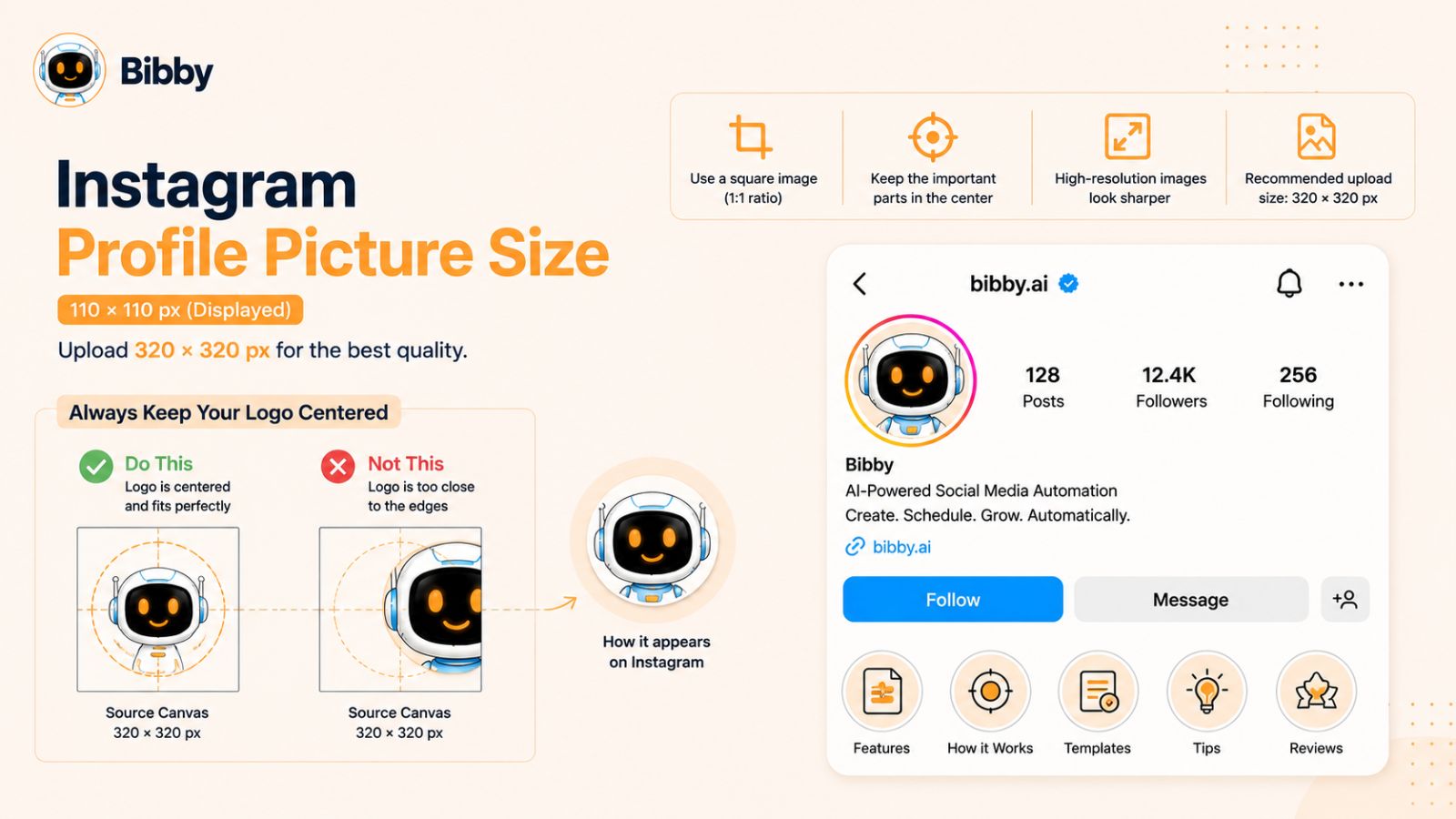
For individuals, that usually means using a clear, recognizable headshot. For businesses, a simple logo or brand mark generally works best.
What Size Should an Instagram Profile Picture Be?
For the source image, use:
1080 × 1080 pixels — 1:1 aspect ratio
Starting with a high-resolution square image gives you flexibility and helps avoid unnecessary quality loss.
Instagram displays the finished profile image at a much smaller size, so don't try to communicate a complicated message inside it. Your profile picture should be recognizable when viewed as a small thumbnail.
Remember: Instagram Displays It as a Circle
Although your source file should be square, Instagram presents the profile picture in a circular shape.
That means the corners of your 1080 × 1080 image won't be visible.
This matters when positioning:
- Logos
- Faces
- Initials
- Brand symbols
- Product marks
- Other important visual elements
Keep the essential parts of the design comfortably within the center of the image. A logo that extends too close to the corners may be clipped or become difficult to recognize.
Best Profile Picture for Personal Brands
If you're building a personal brand, a clear headshot is usually more useful than a complex graphic.
Choose an image where:
- Your face is easy to recognize.
- The lighting is clear.
- The background isn't overly distracting.
- Your face occupies an appropriate portion of the frame.
- The image still looks recognizable at thumbnail size.
Avoid using a full-body photograph from a significant distance. Once reduced to Instagram's small profile display, facial details can disappear.
Best Profile Picture for Businesses
For a business account, a recognizable logo or brand symbol can provide stronger consistency.
However, don't automatically use your entire wordmark if it contains lots of small text. A detailed logo that looks excellent on a website header may become unreadable when reduced to a small circular profile image.
A simplified brand mark, icon, or abbreviated logo can sometimes work better.
This is also a good reason to establish a consistent brand kit containing your approved logo variations, colors, typography, and other visual elements.
With Bibby's chat interface, for example, you can create and manage a brand kit as part of your broader social media workflow. That can help keep your social content visually consistent rather than treating every post as a completely separate design project.
Common Instagram Profile Picture Mistakes
Using a low-resolution image
A tiny source image may appear soft or pixelated after processing. Start with a sufficiently large, high-quality source.
Putting important elements near the corners
Remember that Instagram displays the image as a circle. Keep critical content toward the center.
Using too much text
A profile picture is not the place for a detailed message. Small text is difficult to read at thumbnail size.
Changing the profile image too frequently
For businesses and established creators, consistency can help people recognize the account. Frequent changes can make recognition harder, particularly when audiences encounter the account in comments or other areas of Instagram.
Ignoring the thumbnail test
Always check how your profile picture looks when it is small. If you have to zoom in to understand it, simplify the design.
Does Your Profile Picture Need to Match Your Posts?
It doesn't need to be identical to your feed design, but it should feel connected to your overall visual identity.
For a business, that could mean using the same logo treatment and brand colors that appear throughout its social content. For a personal brand, it might mean maintaining a consistent photography style, color treatment, or recognizable visual identity.
The goal is simple: someone should be able to recognize your account across your social presence.
Build the Rest of Your Social Presence Around the Brand
A strong profile image is only one small component of a recognizable social media presence. Your posts, captions, campaigns, publishing frequency, and visual style all contribute to the overall experience.
That's where a centralized platform such as Bibby can become useful. You can upload existing media or generate images with AI, choose a posting style, automatically generate captions, and schedule content at AI-optimized times across your selected social platforms.
Bibby supports Instagram, Facebook, LinkedIn, YouTube, and TikTok, as well as images, carousels, videos, and Stories. Its chat interface also lets you manage social media conversationally, including tasks such as creating a brand kit, creating campaigns, creating posts, and regenerating captions.
So while 1080 × 1080 pixels is the technical starting point for your Instagram profile picture, the larger objective is maintaining a recognizable, consistent brand across everything you publish.
Instagram Video Sizes: Complete Guide for 2026
Instagram video can appear in several formats, and the best dimensions depend on where the video will be published. For most full-screen vertical content, 1080 × 1920 pixels at a 9:16 aspect ratio is the practical standard for Stories and Reels. Feed video can use different proportions depending on the composition.
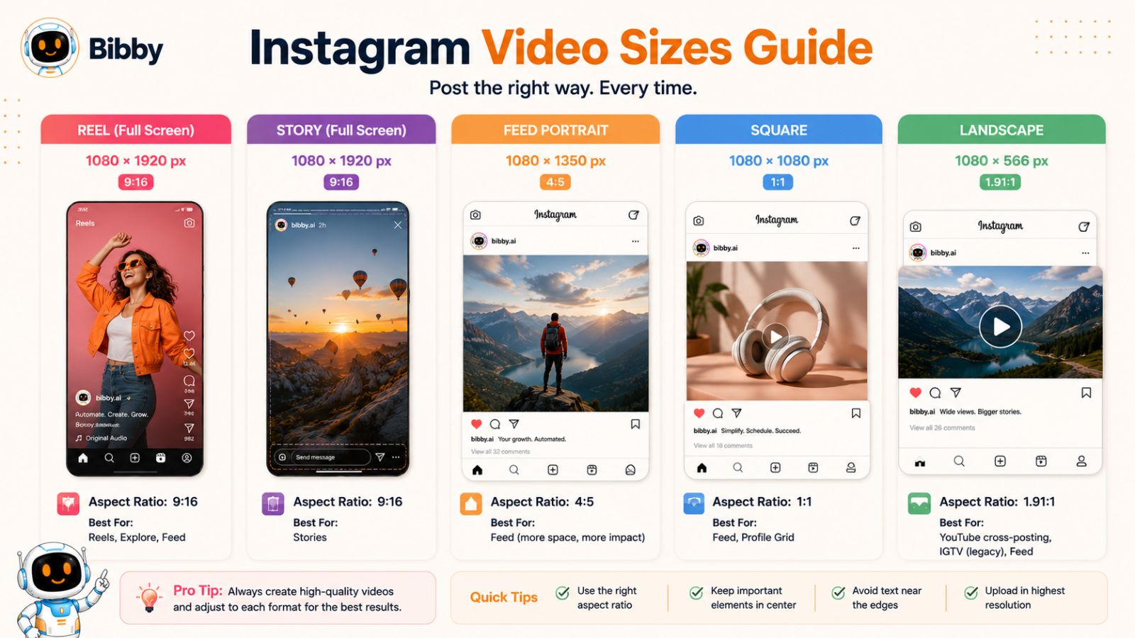
The important distinction is that video dimensions are not one-size-fits-all. A video created specifically for a Reel may need to be framed differently from one designed for the feed.
Instagram Video Dimensions at a Glance
| Video format | Recommended dimensions | Aspect ratio |
|---|---|---|
| Reel | 1080 × 1920 px | 9:16 |
| Story video | 1080 × 1920 px | 9:16 |
| Vertical feed video | 1080 × 1350 px | 4:5 |
| Square feed video | 1080 × 1080 px | 1:1 |
| Landscape feed video | 1080 × 566 px | ~1.91:1 |
These dimensions give you a practical starting point when preparing video for Instagram. Always consider the specific placement you're designing for rather than assuming one exported video will look equally good everywhere.
Best Size for Instagram Reels and Stories
For full-screen vertical video, 1080 × 1920 pixels at 9:16 is the format to prioritize.
This allows the video to fill the phone screen and gives you enough vertical space to frame a person, product, demonstration, or other subject naturally.
When recording specifically for vertical social content, think about the final frame before you start shooting. Leave enough space for subtitles and other essential information, and avoid placing the main subject so close to the edge that reframing becomes difficult.
Best Size for Instagram Feed Video
Feed videos have more flexibility.
A 1080 × 1350 pixel 4:5 composition is useful when you want vertical video that occupies more feed space. Square 1080 × 1080 video can be appropriate for centered compositions or existing square creative, while approximately 1080 × 566 can work when the video depends on a wide landscape composition.
The right choice depends on the source footage and the story you're trying to tell.
For example, a talking-head video can often be reframed effectively for vertical viewing. A wide product demonstration involving several objects may lose important context if aggressively cropped.
Resolution Isn't the Same as Video Quality
It's easy to focus on pixel dimensions and overlook everything else that affects perceived quality.
A 1080 × 1920 video can still look poor if the source footage is blurry, poorly lit, heavily compressed, or incorrectly exported.
For better results:
- Start with high-quality original footage.
- Avoid unnecessary repeated exports.
- Keep text large enough for mobile screens.
- Use good lighting.
- Check framing before publishing.
- Preview the final export on a smartphone.
- Keep a high-quality master copy of your original footage.
The goal is not merely to satisfy a dimension requirement. It's to create video that remains clear and easy to consume after processing and mobile playback.
Design for the Mobile Viewing Experience
Social video is usually consumed quickly, often while the viewer is scrolling. Your composition therefore needs to work at a small size.
If you're adding text, prioritize readability over fitting as much information as possible onto the screen.
Use:
- Short headlines
- High contrast
- Clear typography
- Strong visual hierarchy
- Adequate spacing
- Captions or subtitles when appropriate
Also remember that platform interface elements can overlap the video. Keep important information away from areas where controls, captions, account information, or other UI elements may appear.
Should You Create Different Versions for Different Platforms?
Often, yes.
A single video can potentially be repurposed across Instagram, TikTok, YouTube, Facebook, and other platforms. But simply uploading the exact same file everywhere isn't always the best approach.
The audience, interface, available screen space, and content conventions can differ between platforms. A video may benefit from different framing, captions, cover designs, or introductions depending on where it is published.
The more platforms you manage, the more quickly this becomes a workflow problem.
Use Bibby to Automate Your Video Publishing Workflow
Bibby is designed to reduce the manual work involved in turning finished creative into scheduled social content.
You can upload your video or generate visual content with AI, choose your posting style, and have Bibby automatically generate captions. Then, instead of manually scheduling every platform and date, you can schedule your content across your selected channels at AI-optimized times.
Bibby supports Instagram, Facebook, LinkedIn, YouTube, and TikTok, making it possible to manage a broader multi-platform publishing workflow from one place.
It also supports images, carousels, videos, and Stories, so you're not limited to one content type.
And with Bibby's chat interface, social media management can become conversational. You can use the chat to create a brand kit, create a campaign, create posts, regenerate captions, and manage other publishing tasks.
That means your workflow can move from:
Create video → manually write caption → manually schedule → repeat
to a more centralized process:
Create or upload media → choose posting style → generate caption → schedule → manage across platforms
A Practical Video Workflow
If you're publishing short-form video consistently, a simple workflow can help:
1. Create a high-quality master video.
Keep the original footage available for future adaptations.
2. Choose the primary format.
Use 9:16 when the video is intended primarily for vertical full-screen viewing.
3. Reframe when necessary.
Don't let automatic cropping remove important subjects or information.
4. Add mobile-friendly text.
Keep subtitles and other important information readable.
5. Upload the finished creative to Bibby.
You can use an existing video or create visual content with AI.
6. Select your posting style and generate the caption.
Bibby can automatically create the caption based on your chosen style.
7. Schedule across your selected platforms.
Use AI-optimized scheduling to distribute your content without manually choosing every publishing time.
This workflow allows you to spend more time producing useful content and less time repeating administrative publishing tasks.
Instagram Ad Sizes and Dimensions in 2026
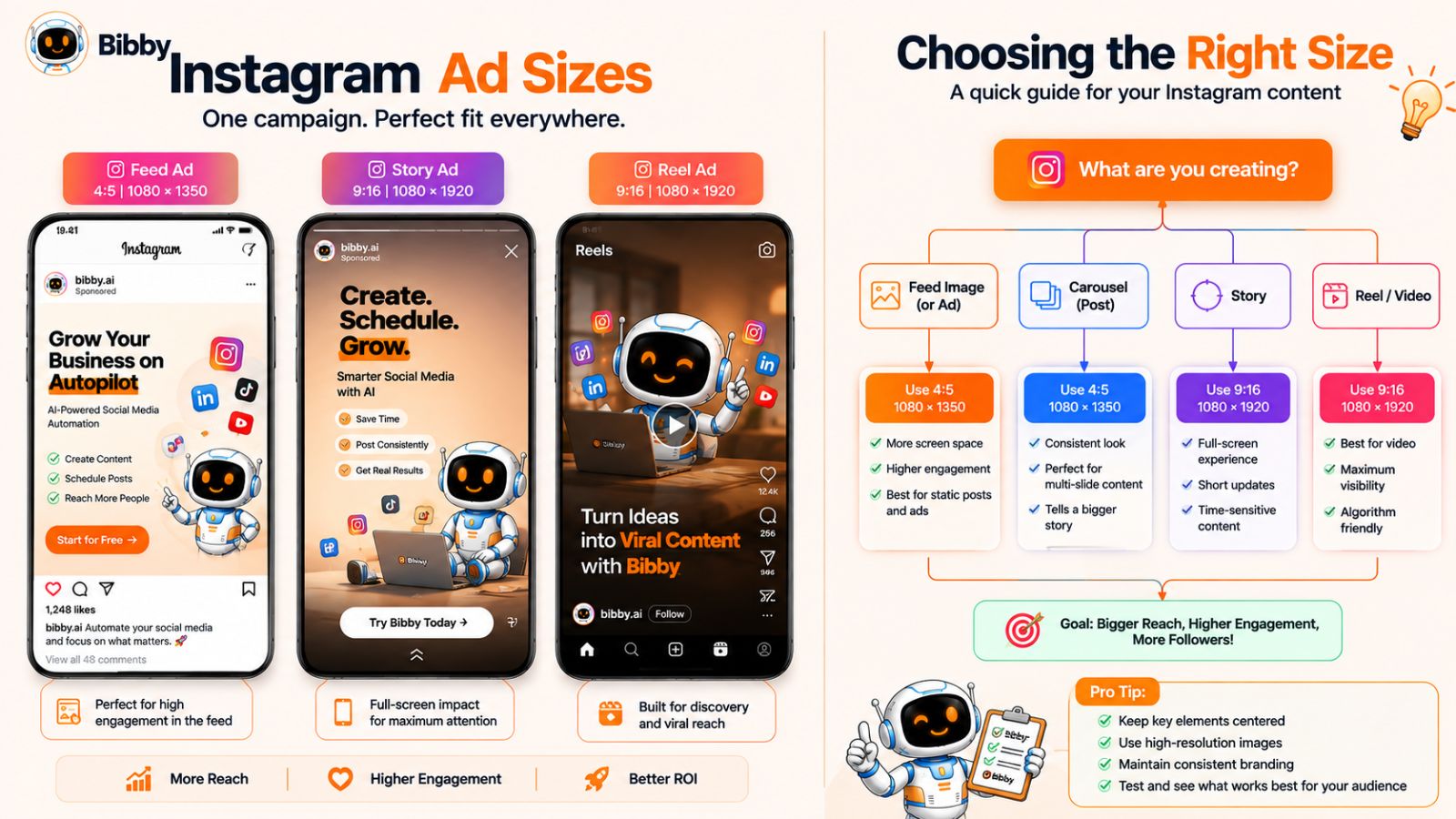
Instagram advertising uses many of the same visual formats as organic content, but advertisers need to think about placement, composition, and campaign flexibility in addition to basic image dimensions.
A single creative can appear differently depending on where it is delivered. For that reason, the best approach is to create high-quality source assets and adapt them deliberately for each placement rather than relying on one image or video for everything.
Common Instagram Ad Formats
The most important formats to consider are:
| Instagram ad placement | Practical creative format | Aspect ratio |
|---|---|---|
| Feed image ad | 1080 × 1350 px | 4:5 |
| Square feed ad | 1080 × 1080 px | 1:1 |
| Landscape feed ad | ~1080 × 566 px | ~1.91:1 |
| Stories ad | 1080 × 1920 px | 9:16 |
| Reels ad | 1080 × 1920 px | 9:16 |
These are useful production targets, but ad specifications can change over time. If you're preparing creative for an active paid campaign, always verify the current requirements for the specific advertising placement before final export.
Best Instagram Feed Ad Size
For a feed-first image advertisement, 1080 × 1350 pixels at 4:5 is a strong format to consider.
The portrait composition gives the creative substantial vertical presence while providing enough space for product imagery, branding, and a concise message.
However, don't confuse additional canvas space with permission to add more copy. An effective advertisement should still communicate its value proposition quickly.
A useful hierarchy is:
- Primary visual or message
- Supporting benefit
- Brand identification
- Clear next action
The exact design depends on the campaign, but the principle remains the same: make the advertisement easy to understand before asking the viewer to do anything.
Best Instagram Story and Reels Ad Size
For full-screen vertical placements, 1080 × 1920 pixels at 9:16 is the practical format to prioritize.
Vertical advertising can feel native to the experience when it is designed specifically for mobile viewing.
Avoid taking a horizontal advertisement and simply placing it inside a vertical frame. If the original creative was designed for another placement, create a new composition that takes advantage of the vertical canvas.
Design Around Safe Areas
Interface elements can appear over advertising creative, so avoid putting essential information directly against the edges.
This is especially important for:
- Headlines
- Product names
- Prices
- Logos
- Calls to action
- Subtitles
- Important visual details
A safe-area mindset also makes your creative easier to repurpose. If your essential content is already comfortably positioned within the composition, adapting it to another placement becomes less painful.
Should You Create One Ad Creative or Multiple Versions?
For campaigns running across several placements, multiple adapted versions are often preferable to one universal asset.
Consider creating:
- A 4:5 feed version
- A 1:1 square version when useful
- A 9:16 Story/Reel version
The underlying campaign message can remain consistent while the composition changes to fit each placement.
This is particularly important for video. A vertical Reel-style video and a landscape video may tell the same story, but they shouldn't necessarily use the exact same framing.
Don't Sacrifice the Creative for the Dimensions
Dimensions should support your advertising strategy—not replace it.
A perfectly sized ad can still perform poorly if:
- The value proposition isn't clear.
- The opening visual isn't compelling.
- The text is difficult to read.
- The product isn't recognizable.
- The call to action is unclear.
- The creative doesn't match the audience.
- The landing-page experience doesn't deliver on the promise.
Think of dimensions as the technical foundation. The creative strategy determines what you build on that foundation.
How Bibby Fits Into a Broader Social Media Workflow
Paid campaigns aren't the only reason businesses need multiple versions of their content. Organic social publishing also requires different formats, captions, schedules, and platform-specific adaptations.
Bibby helps centralize that workflow. You can upload your existing media or generate images with AI, choose a posting style, and let Bibby automatically generate captions. You can then schedule content at AI-optimized times across selected platforms.
That includes Instagram, Facebook, LinkedIn, YouTube, and TikTok, with support for images, carousels, videos, and Stories.
Bibby's chat interface also allows you to manage social media conversationally. You can create a brand kit, create campaigns, create posts, regenerate captions, and handle other social media tasks through chat.
For a business producing a large volume of creative, that means the workflow doesn't have to end when the designer exports the final asset. The content can move directly into a system for organizing, captioning, and scheduling it.
Keep Your Paid and Organic Creative Systems Connected
A campaign may generate several useful assets beyond the original advertisement.
For example, a product launch could produce:
- A 4:5 Instagram feed graphic
- A 9:16 Reel
- A Story sequence
- A carousel explaining the product
- A customer-focused post
- A behind-the-scenes video
- A LinkedIn announcement
- A Facebook post
- A YouTube video
Instead of treating every asset as a completely separate project, you can build a content system around the same campaign idea and adapt the creative for each channel.
Bibby's campaign and chat workflows can support that broader approach, helping turn individual pieces of creative into an organized publishing schedule.
Bottom Line
For Instagram advertising, prioritize 4:5 for feed creative and 9:16 for full-screen Story and Reel placements, while creating adapted versions when the placement requires a different composition.
Most importantly, don't let dimensions become an afterthought. Start with high-quality creative, design around the placement, protect important information from interface overlays, and use a repeatable publishing workflow to manage the resulting assets.
For businesses managing organic and multi-platform content alongside campaigns, Bibby can bring creation, AI caption generation, scheduling, and social media management into one workflow.
How to Choose the Right Instagram Size for Your Content
Knowing Instagram's recommended dimensions is useful, but the more important question is: which format should you choose for the specific content you're creating?
The answer depends on the type of media, the composition, the publishing placement, and what you want the audience to do. Instead of forcing every asset into the same dimensions, build a simple format-selection system.
Use 4:5 for Most Feed-First Image Content
If you're creating a new image specifically for the Instagram feed and don't have a strong reason to use another format, 1080 × 1350 pixels at 4:5 is a reliable default.
Use it for:
- Educational graphics
- Product announcements
- Promotional posts
- Quotes
- Statistics
- Infographics
- Product photography
- Thought-leadership visuals
The additional vertical space gives the content a larger presence while scrolling.
However, don't resize an image into 4:5 if doing so destroys the composition. A technically correct format isn't useful if the subject is badly cropped.
Use 1:1 When the Square Composition Makes Sense
Choose 1080 × 1080 pixels at 1:1 when the content naturally works as a square.
This can be particularly useful for:
- Centered product photography
- Simple graphics
- Logos or brand marks
- Existing square creative
- Consistent square template systems
If you already have a strong library of square assets, you don't need to rebuild everything. Instead, evaluate whether future content benefits from portrait dimensions.
Use 9:16 for Stories and Reels
When your content is intended to fill the phone screen, choose 1080 × 1920 pixels at 9:16.
This should be your primary format for:
- Instagram Stories
- Instagram Reels
- Vertical short-form video
- Full-screen promotional creative
- Mobile-first visual sequences
Design specifically for the vertical canvas whenever possible rather than converting horizontal creative at the last minute.
Use Landscape When the Composition Requires It
Landscape content is appropriate when the width of the image is central to its meaning.
For example, a panoramic photograph may lose its visual impact when cropped into a tall portrait. Similarly, a wide group photograph may require landscape orientation to keep everyone in the frame.
In these cases, use the format that preserves the content.
The best social media strategy isn't about blindly following a single "best" size. It's about balancing platform optimization with creative integrity.
Use the Content Type as Your Decision Framework
A simple decision tree can make format selection much easier:
Is it a full-screen Story or Reel?
→ Use 9:16 / 1080 × 1920.
Is it a new feed image designed primarily for Instagram?
→ Start with 4:5 / 1080 × 1350.
Is the composition naturally square?
→ Use 1:1 / 1080 × 1080.
Would cropping damage a wide composition?
→ Consider landscape / approximately 1.91:1.
This approach eliminates unnecessary guesswork while leaving room for creative judgment.
Think About Where the Content Will Go Next
The format decision becomes more complicated when the same content will be published across multiple platforms.
A portrait Instagram post may need to be adapted for another network. A vertical Reel may also be useful for TikTok and YouTube. A carousel idea may become a LinkedIn document or a series of posts.
Instead of creating every variation manually, consider designing your workflow around a master piece of content and then adapting it where necessary.
For example:
Master idea: "5 Instagram mistakes businesses should avoid"
That one idea could become:
- An Instagram carousel
- An Instagram Reel
- An Instagram Story sequence
- A Facebook post
- A LinkedIn post
- A TikTok video
- A YouTube Short
The message remains connected, but the presentation changes according to the platform.
Don't Optimize Only for Dimensions
A common mistake is assuming that choosing the correct pixel size automatically makes content effective.
It doesn't.
You also need to consider:
- The strength of the hook
- Visual hierarchy
- Readability
- Brand consistency
- Audience relevance
- Caption quality
- Publishing timing
- Content frequency
- The goal of the post
A perfectly sized image with a weak message won't suddenly become engaging because it uses 1080 × 1350 pixels.
Think of dimensions as the technical foundation. Your content strategy, creative quality, and distribution system determine what happens on top of that foundation.
Let Bibby Handle More of the Publishing Process
Once you start creating content in several formats, manual publishing can quickly become one of the most time-consuming parts of social media management.
You may have to:
- Prepare the creative.
- Resize or adapt it.
- Write a caption.
- Choose hashtags or supporting copy.
- Decide on a publishing date.
- Select a publishing time.
- Upload it to Instagram.
- Repeat the process for other platforms.
Bibby is built to simplify this workflow.
You can upload your image or generate an image with AI, choose your posting style, and let Bibby automatically generate a caption. Then you can schedule your media across selected platforms at AI-optimized times.
Bibby supports Instagram, Facebook, LinkedIn, YouTube, and TikTok, as well as images, carousels, videos, and Stories.
Its chat interface takes the workflow a step further. Instead of navigating through individual functions, you can manage social media conversationally—such as creating a brand kit, creating a campaign, creating posts, or regenerating captions.
That means format selection remains a creative decision, while much of the repetitive publishing work can be handled through one centralized system.
A Practical Rule to Remember
If you only remember four recommendations from this guide, make them these:
- Feed portrait: 1080 × 1350 px — 4:5
- Feed square: 1080 × 1080 px — 1:1
- Stories and Reels: 1080 × 1920 px — 9:16
- Landscape feed: approximately 1080 × 566 px — 1.91:1
Then choose the format that best preserves the content and supports the viewer's experience.
Common Instagram Image Size Mistakes to Avoid
Knowing the correct Instagram dimensions is only half the job. You can export an image at exactly the recommended size and still end up with content that looks blurry, cramped, poorly cropped, or difficult to read.
Most Instagram sizing problems come from a mismatch between the creative, the format, and the way the content will actually be viewed.
Here are the mistakes worth avoiding.
1. Using the Wrong Aspect Ratio
An image can have the correct number of pixels but still use the wrong proportions for its intended placement.
For example, designing a 1080 × 1080 square image and assuming it will behave exactly like a 1080 × 1350 portrait post means you're overlooking the aspect ratio.
Before exporting, identify the destination:
- Feed portrait → 4:5
- Feed square → 1:1
- Feed landscape → approximately 1.91:1
- Stories → 9:16
- Reels → 9:16
Choosing the aspect ratio at the beginning of the design process is much easier than trying to repair a badly cropped asset afterward.
2. Stretching an Image Instead of Cropping or Reframing It
Never distort an image simply to make it fit the required dimensions.
Stretching a person's face, product, building, or other recognizable object can make an otherwise professional asset immediately look amateur.
Instead, crop the image deliberately or recompose it within the new canvas.
If the original composition cannot be adapted without losing important information, keep the original format or create a separate version specifically for Instagram.
3. Starting With a Low-Resolution Image
Making a small image larger doesn't magically add detail.
For example, taking a 500-pixel-wide image and enlarging it to 1080 pixels may technically produce a 1080-pixel-wide file, but the underlying image information hasn't increased.
For important social media content, start with a high-quality source and export the final asset at an appropriate resolution.
This is particularly important for:
- Product photography
- Professional photography
- Logos
- Text-heavy graphics
- Advertisements
- Campaign creative
4. Putting Text Too Close to the Edges
Correct dimensions don't guarantee that your text will remain comfortable to read.
When designing Instagram content, give headlines, logos, prices, and calls to action enough breathing room around the edges.
This becomes even more important for Stories and Reels, where Instagram's interface can occupy portions of the screen.
A good design should still look balanced even when viewed on a smaller mobile display.
5. Using Tiny Text
One of the most common mistakes with Instagram graphics is trying to put too much information into one image.
Remember that your audience is usually viewing the content on a smartphone.
If someone needs to zoom in to read your graphic, you've created friction.
Instead:
- Use fewer words.
- Increase font size.
- Establish a clear headline.
- Break complex information across carousel slides.
- Put additional context in the caption.
A carousel is often a better solution than shrinking a paragraph until it technically fits inside one image.
6. Mixing Different Dimensions in a Carousel
If you're publishing a carousel, keep the slides consistent.
A sequence containing portrait, square, and landscape images can create an inconsistent viewing experience and make the carousel feel less polished.
Whenever possible, design every slide using the same canvas and aspect ratio.
For most educational and branded carousels, 1080 × 1350 pixels at 4:5 is a practical starting point.
7. Designing for Desktop Instead of Mobile
An image can look perfect on a large monitor and become difficult to understand on a phone.
This is particularly common with:
- Small typography
- Detailed charts
- Complex infographics
- Tiny product information
- Subtle color combinations
Always preview important Instagram content at approximately the size your audience will actually see it.
If the message isn't immediately understandable on a phone, redesign it.
8. Using One Asset Everywhere Without Adapting It
Repurposing content is efficient. Blindly duplicating the exact same creative everywhere isn't always.
Instagram Feed, Stories, Reels, TikTok, LinkedIn, Facebook, and YouTube can all have different visual contexts.
A landscape image might work beautifully in one placement and look awkward in another. A Reel may need different text positioning when adapted for another platform.
The goal is efficient adaptation, not identical duplication.
9. Forgetting the Thumbnail
Video content can look excellent once it starts playing but still have a weak thumbnail.
Your cover or opening frame may determine whether someone understands the topic before watching.
Use clear visual hierarchy and make the subject immediately recognizable. Avoid relying on tiny text that disappears when the video is displayed as a small thumbnail.
10. Repeatedly Compressing the Same Asset
Every unnecessary export or conversion can introduce additional quality loss, particularly with video and heavily compressed images.
Keep a high-quality master version of your creative. Generate your platform-specific versions from that original rather than repeatedly modifying an already compressed file.
This also makes future repurposing much easier.
11. Treating Instagram Dimensions as a Substitute for Good Content
This may be the biggest mistake of all.
Correct dimensions can improve presentation, but they don't automatically make a post useful, interesting, persuasive, or shareable.
Strong Instagram content still needs:
- A clear idea
- A relevant audience
- Strong visual communication
- A compelling hook
- Readable design
- Consistent branding
- Useful captions
- A reason for the audience to engage
Think of dimensions as the technical foundation—not the entire strategy.
How Bibby Helps Prevent the Publishing Workflow From Becoming a Bottleneck
Once you've created properly formatted creative, there's another challenge: actually publishing it consistently.
For an active brand, social media can involve dozens of repetitive tasks every week—uploading media, writing captions, organizing campaigns, selecting dates, choosing publishing times, and repeating the process across multiple platforms.
Bibby brings those tasks into a single social media scheduling and automation workflow.
You can upload your image or generate an image with AI, choose your posting style, and let Bibby generate the caption automatically. You can then schedule the media at AI-optimized times across your selected platforms.
Bibby supports Instagram, Facebook, LinkedIn, YouTube, and TikTok, along with images, carousels, videos, and Stories.
And because Bibby now includes a chat interface, you can manage social media through conversation rather than treating every task as a separate workflow. You can use chat to create a brand kit, create a campaign, create posts, regenerate captions, and manage other social media tasks.
The result is a useful division of labor: you focus on creating content that deserves attention; Bibby helps handle the repetitive work required to distribute it consistently.
Quick Instagram Sizing Checklist
Before publishing, ask:
- Is the aspect ratio appropriate for the destination?
- Is the source image high quality?
- Have I avoided stretching or distorting the creative?
- Is important information away from the edges?
- Is the text readable on a phone?
- Are all carousel slides consistent?
- Does the content still look good as a thumbnail?
- Have I created separate versions when another platform requires a different composition?
If the answer is yes, your creative is much more likely to look intentional when it reaches your audience.
How to Resize Instagram Content Without Losing Quality
Resizing social media content sounds simple until an image that looked perfect in its original format becomes cropped, blurry, or poorly balanced after adaptation.
The key is to understand that resizing and redesigning are not always the same thing. Changing an image from 16:9 to 4:5, for example, can remove important parts of the composition. A good resizing workflow therefore preserves the subject, readability, and visual hierarchy—not just the required pixel dimensions.
Start With a High-Quality Master Asset
The easiest way to maintain quality across multiple social formats is to keep the highest-quality version of your original creative.
For images, that might be the original photograph or a large design file. For video, keep the original high-resolution footage or master export.
Then create platform-specific versions from that master.
This is better than repeatedly resizing an already compressed Instagram image. If you resize, compress, and export the same asset multiple times, you have fewer options for maintaining quality.
Crop Instead of Stretching
When an image needs to fit a different aspect ratio, crop or recompose it rather than stretching it.
For example, suppose your original image is landscape but you want a 4:5 Instagram feed post. A simple automatic crop might remove the subject's face or an important product detail.
Instead:
- Identify the most important part of the image.
- Choose the target aspect ratio.
- Reposition the focal point.
- Crop away less important areas.
- Check the result at mobile size.
- Adjust the composition manually if necessary.
This takes slightly more effort, but the result looks intentional rather than automatically generated.
Preserve the Focal Point
Every visual has one or more elements that deserve the viewer's attention.
That might be:
- A person's face
- A product
- A logo
- A headline
- A specific object
- A landscape feature
- A demonstration or action
When adapting an asset, identify that focal point before changing the canvas.
If an automatic crop cuts through the focal point, the technically correct dimensions won't matter. The image has lost the thing that made it useful.
Use Different Canvas Sizes for Different Content
If you're creating content regularly, don't try to make one universal template handle every social placement.
A simple template system might include:
Feed template:
1080 × 1350 pixels, 4:5
Square template:
1080 × 1080 pixels, 1:1
Story/Reel template:
1080 × 1920 pixels, 9:16
Having dedicated templates makes production faster and reduces the likelihood of accidentally publishing creative with the wrong proportions.
It also gives your designers or content team a repeatable framework for maintaining brand consistency.
Resize Text and Logos Separately
One of the biggest problems with automated resizing is that visual elements don't always scale intelligently.
A headline that looks appropriately sized on a 1080 × 1350 design may become too small when placed on a larger or differently proportioned canvas.
The same applies to:
- Logos
- Icons
- Buttons
- Product labels
- Charts
- Calls to action
When adapting a design, check these elements individually rather than assuming the entire composition can simply be scaled proportionally.
Don't Put Everything Into the Image
If you're adapting a graphic and struggling to fit all the information into a smaller canvas, the solution isn't necessarily to make the typography smaller.
Ask whether every piece of information needs to be inside the image.
Instagram captions can provide additional context. Carousel slides can divide a complex topic into multiple screens. Stories can distribute information across a sequence.
For example, instead of forcing ten tips into one 1080 × 1350 graphic, create a carousel with one or two ideas per slide.
Better information architecture usually produces a better result than smaller typography.
Check the Final Asset on a Smartphone
Desktop previews can be misleading.
A design may look spacious and readable on a large monitor but become cramped when displayed on a phone.
Before publishing important content, check:
- Can you read the headline immediately?
- Is the focal point obvious?
- Are logos recognizable?
- Is the contrast sufficient?
- Is any important information too close to an edge?
- Does the composition still look balanced at a small size?
This simple review catches many problems before they reach your audience.
Build a Reusable Resizing Workflow
If your business publishes frequently, resizing shouldn't require starting from scratch every time.
Create a small library of templates for your most common formats and establish rules for:
- Brand colors
- Fonts
- Logo placement
- Margins
- Headline styles
- Image treatment
- Calls to action
This turns resizing from a creative emergency into a predictable production process.
Automate the Repetitive Parts With Bibby
Once you've prepared your visual assets, the next challenge is distributing them consistently.
This is where Bibby can fit into the workflow. Instead of uploading content separately, manually writing every caption, and scheduling each post one by one, you can bring those steps into a centralized social media automation workflow.
With Bibby, you can:
- Upload your image or media or generate an image with AI.
- Choose your posting style.
- Let Bibby generate the caption automatically.
- Select your social platforms.
- Schedule your content at AI-optimized times.
You can manage content for Instagram, Facebook, LinkedIn, YouTube, and TikTok, with support for images, carousels, videos, and Stories.
Bibby also includes a chat interface that lets you manage social media conversationally. You can use chat to create a brand kit, create a campaign, create posts, regenerate captions, and handle other social media management tasks.
That distinction is important: automation shouldn't replace creative judgment. You still decide what content you want to publish and how it should look. Bibby helps remove much of the repetitive work between having a finished asset and getting that content consistently published.
A Practical Example
Imagine a company has a product photograph that was originally created in a wide format.
Rather than stretching the photograph into a portrait post, the team could:
- Keep the original photograph as the master asset.
- Create a deliberate 4:5 Instagram composition.
- Create a 9:16 version for Stories or Reels if appropriate.
- Add platform-specific text where necessary.
- Upload the finished assets to Bibby.
- Select the desired posting style.
- Let Bibby generate the captions.
- Schedule the content across the company's selected platforms.
The result is not simply "one image resized several times." It's one content idea adapted thoughtfully into multiple social formats and then distributed through a repeatable workflow.
How to Create and Schedule Instagram Posts Automatically With Bibby
Knowing the right Instagram dimensions is useful, but consistently publishing high-quality content is a much bigger challenge.
For many creators and businesses, the bottleneck isn't coming up with another post. It's everything that happens afterward: preparing the media, writing captions, choosing publishing dates, finding the right times, and repeating the process across multiple social platforms.
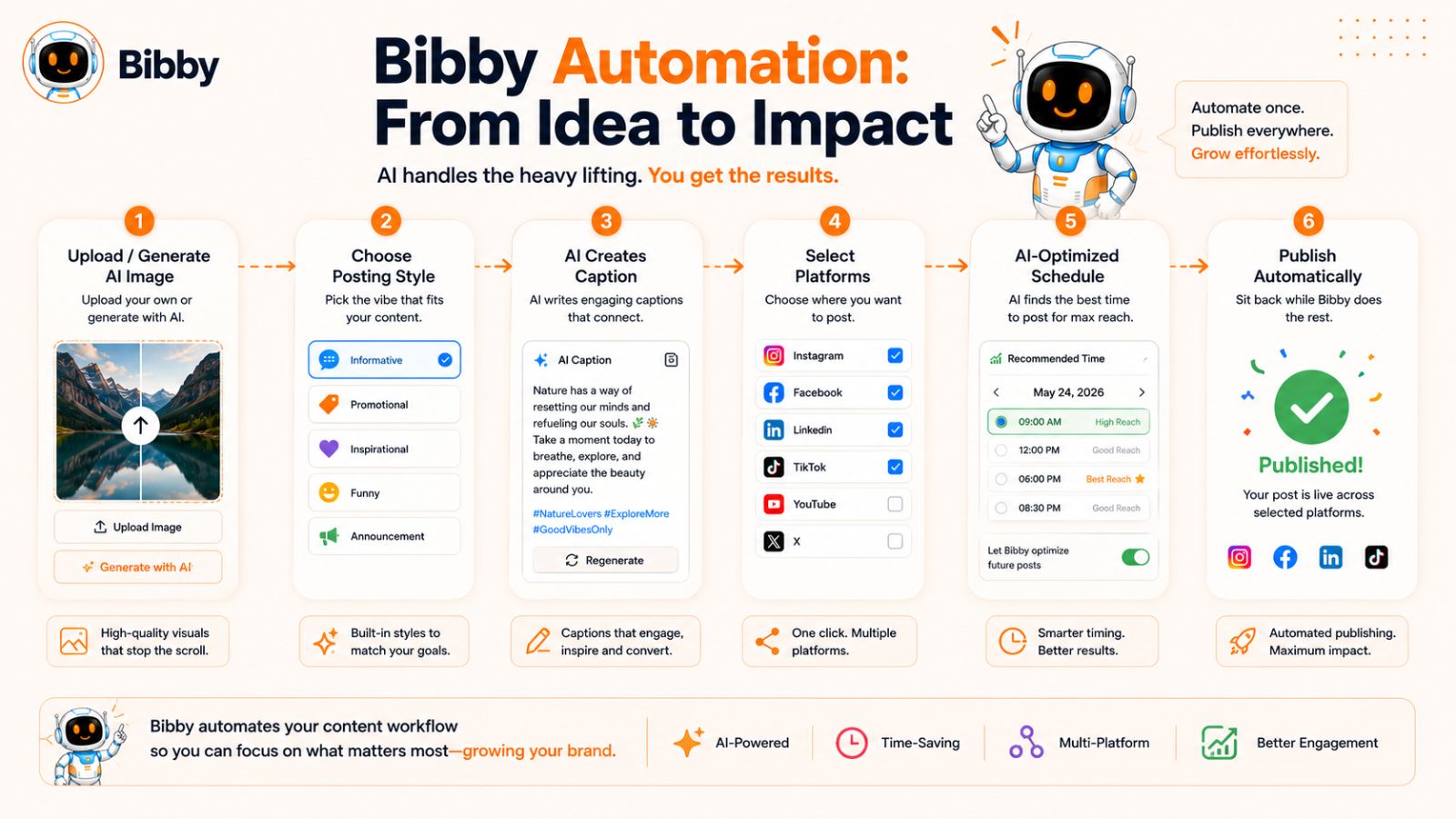
Bibby is built to turn that repetitive workflow into a simpler, automated process.
Instead of managing content creation and scheduling as disconnected tasks, you can move from an idea or visual asset to a scheduled social media post through one workflow.
What Is Bibby?
Bibby is a social media scheduling and automation tool designed to help you create, manage, and publish content across multiple social platforms.
The workflow is intentionally simple:
Upload or generate → choose a posting style → generate captions → schedule → publish.
You can upload your own media or generate images with AI. Once your creative is ready, you choose the posting style you want, and Bibby can automatically generate the caption for the post.
You can then schedule your content across the platforms you've selected at AI-optimized times.
Instead of manually deciding when every individual piece of content should be published, Bibby helps turn your content library into an organized publishing schedule.
Step 1: Upload Your Image or Generate One With AI
Start with the visual.
If you've already created an Instagram image, carousel, video, or Story, you can upload your existing media.
If you need a visual, Bibby can also help you generate an image with AI.
This gives you flexibility depending on how your content team works. You don't have to rebuild your existing creative library just to use an automation platform.
For example, you might already have:
- Product photographs
- Brand graphics
- Customer images
- Educational visuals
- Short-form videos
- Carousel designs
You can bring those assets into your publishing workflow instead of treating them as separate files that need to be manually uploaded to every platform.
Step 2: Choose Your Posting Style
Once your media is ready, choose the posting style that fits the content and your brand.
This matters because the same visual can communicate very differently depending on the tone and purpose of the post.
A product image might need a promotional style. An educational graphic might benefit from a more informative approach. A behind-the-scenes image might work better with a conversational style.
Giving Bibby this direction helps the generated caption align with the type of content you're trying to publish.
Step 3: Let Bibby Generate the Caption
Writing captions for every social media post can become one of the most repetitive parts of content management.
Bibby can generate captions automatically based on your selected posting style.
That means you don't have to start with a blank caption box every time you upload an image.
You can then review the generated content and make adjustments when needed. Automation works best when it accelerates your workflow without removing your ability to maintain your brand's voice and judgment.
Step 4: Select Your Social Platforms
Your content doesn't have to stop at Instagram.
Bibby can help you manage content across:
- YouTube
- TikTok
This is particularly useful when a single campaign needs to appear across several channels.
Instead of logging into each platform separately and repeating the same administrative process, you can manage your selected social channels through a centralized workflow.
Step 5: Schedule Content at AI-Optimized Times
Choosing when to publish can be surprisingly time-consuming when you're managing a large content calendar.
Bibby can schedule your media at AI-optimized times, reducing the need to manually determine a publishing time for every post.
This becomes especially useful when you have multiple pieces of content to distribute over several days or weeks.
For example, instead of publishing ten posts manually over ten different days, you can prepare the content in advance and organize it into a schedule.
The result is a more consistent publishing cadence without requiring someone to remember to publish every individual post.
Bibby Supports More Than Static Instagram Images
A modern social strategy isn't built entirely around single-image posts.
Bibby supports multiple content types, including:
- Images
- Carousels
- Videos
- Stories
That means you can build a more varied content calendar without needing a different workflow for every media type.
For example, one campaign could include a product image, an educational carousel, a Reel, and a Story sequence. Instead of managing each asset independently, you can organize them as part of the same broader social publishing system.
Manage Social Media Through Bibby's Chat Interface
Bibby's workflow goes beyond traditional dashboards.
With its chat interface, you can manage social media through conversation.
Instead of searching through different menus to find individual functions, you can interact with Bibby directly to handle tasks such as:
- Create a brand kit
- Create a campaign
- Create posts
- Regenerate captions
- Manage other social media tasks
This conversational approach can be particularly useful when you're managing several pieces of content at once.
For example, rather than thinking in terms of individual technical actions, you can approach your workflow as a conversation:
Create a campaign around our new product.
Then continue working with the campaign and its content through the same interface.
The benefit is less context switching between different tools and more focus on the actual marketing objective.
From Instagram Dimensions to a Complete Publishing System
Consider how much work goes into publishing a single Instagram post manually:
Create image → resize image → upload → write caption → choose date → choose time → publish
Now multiply that process by several posts every week and several social platforms.
The administrative burden can become significant.
With Bibby, the workflow becomes more centralized:
Create or upload media → choose posting style → generate caption → select platforms → schedule
That doesn't mean every creative decision should be automated. You still control the content, brand, and strategy.
The value is in removing repetitive execution work from the process.
A Practical Example: One Content Idea, Multiple Posts
Imagine a SaaS company wants to promote a new feature.
The team could create:
Asset 1: A 4:5 Instagram feed graphic explaining the feature.
Asset 2: A carousel showing how the feature works.
Asset 3: A short vertical video demonstrating the feature.
Asset 4: A Story announcing the launch.
Instead of manually publishing each asset, the team can bring the content into Bibby, select appropriate posting styles, generate captions, and schedule the campaign across its selected social platforms.
The same campaign can then extend to Facebook, LinkedIn, YouTube, and TikTok where the relevant content formats make sense.
This is the difference between having social media content and having a social media publishing system.
Why Automation Matters for Consistency
The biggest benefit of automation isn't simply saving a few minutes while uploading a post.
It's making consistency easier.
A business can have excellent content and still struggle with social media because publishing is irregular. Posts get delayed, captions remain unfinished, and content sits in a folder waiting for someone to upload it.
A centralized workflow reduces those points of friction.
When your media, captions, campaigns, and publishing schedule are organized together, maintaining a regular social presence becomes much more manageable.
Manage Your Social Media Through Bibby's Chat Interface
Traditional social media management often means jumping between dashboards, content calendars, caption editors, brand documents, and publishing tools.
Bibby takes a different approach with its chat interface, allowing you to manage many social media tasks through conversation.
Instead of having to remember where every function lives, you can communicate what you want to accomplish and use the same interface to build and manage your social media workflow.
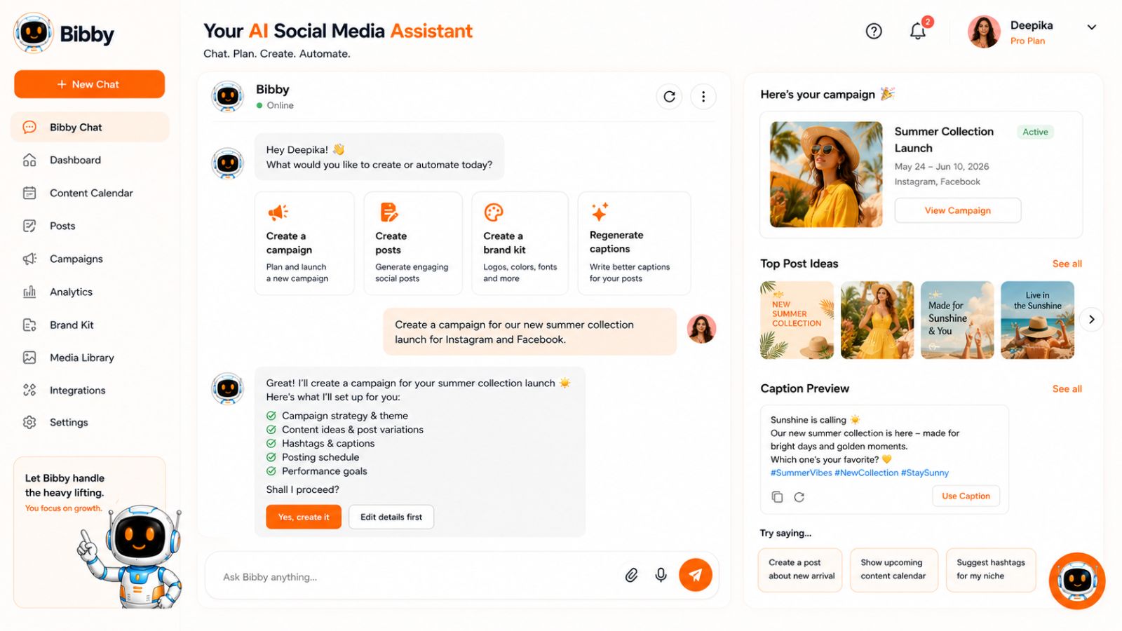
What Can You Do With Bibby's Chat Interface?
Bibby's chat experience can help you manage tasks such as:
- Create a brand kit
- Create a campaign
- Create posts
- Regenerate captions
- Manage other social media tasks conversationally
This makes the chat interface useful not just for generating individual pieces of content, but for managing the broader system behind your social media presence.
Create a Brand Kit Through Chat
Consistency is one of the foundations of recognizable social media content.
A brand may have specific:
- Colors
- Fonts
- Logos
- Visual styles
- Messaging preferences
- Content guidelines
Instead of repeatedly explaining those preferences every time you create a post, you can establish them as part of your brand kit.
Bibby's chat interface lets you create a brand kit as part of your social media workflow.
Once your brand foundation is established, your content creation process can become more consistent because you're working from a defined identity rather than starting from scratch for every post.
This becomes particularly valuable when multiple people contribute to the same social media presence.
Create a Campaign
Individual posts are useful, but effective social media marketing often revolves around campaigns.
A campaign can give several pieces of content a shared objective and theme.
For example, a product launch might include:
- A launch announcement
- An educational carousel
- A product demonstration
- Customer-focused content
- Stories
- Short-form video
- Follow-up posts
Instead of treating these as unrelated uploads, you can organize them around the same campaign concept.
Bibby's chat interface lets you create a campaign, making it easier to move from a single content idea to a coordinated social media initiative.
Create Posts Through Conversation
Traditional content creation often follows a rigid sequence: open a content tool, select a template, enter information, upload media, write a caption, and save the post.
A conversational interface can make the process more natural.
You can use Bibby's chat experience to create posts as part of your broader social workflow.
The advantage isn't that conversation magically replaces good marketing strategy. The advantage is that you can describe the outcome you're trying to achieve instead of manually navigating every individual feature.
That can make the tool easier to use when you're working through multiple content tasks at once.
Regenerate Captions When the First Version Isn't Right
AI-generated captions can accelerate content production, but the first version isn't necessarily going to be perfect for every post.
Maybe the caption is too formal.
Maybe it needs to be shorter.
Maybe you want a different angle.
Maybe the post needs a stronger call to action.
Instead of starting over, Bibby's chat interface allows you to regenerate captions.
This creates a more iterative workflow:
Generate → review → refine → regenerate → approve
The human still provides the judgment. The AI helps reduce the time required to produce and revise the copy.
Chat Makes Social Media Management More Conversational
The larger idea behind Bibby's chat interface is that social media management doesn't always need to feel like operating a collection of software menus.
Think about how a social media manager actually works.
They might start with a goal:
"We need a campaign promoting our new product."
Then they need to figure out:
- What content should we create?
- What should the posts say?
- Which platforms should we use?
- When should everything be published?
- Does the content match our brand?
- Can we reuse some of the creative?
A conversational workflow allows these tasks to happen within a more natural interaction.
Rather than treating every decision as a separate software operation, you can work toward the campaign as a whole.
Combine Chat With Bibby's Automation Workflow
The chat interface becomes even more useful when combined with Bibby's broader scheduling and automation capabilities.
The workflow can move from strategy to execution:
Create your brand kit → create a campaign → create content → upload or generate media → choose a posting style → generate captions → schedule content
Then Bibby can distribute the content across your selected platforms at AI-optimized times.
That can include Instagram, Facebook, LinkedIn, YouTube, and TikTok.
And because Bibby supports images, carousels, videos, and Stories, your campaign doesn't have to rely on one type of content.
Example: Planning an Instagram Campaign With Bibby
Suppose you're launching a new product and want to build awareness over two weeks.
Instead of manually creating every post individually, you could structure the workflow around the campaign.
First: Create or establish the brand kit.
Second: Create the campaign around the product launch.
Third: Add the content—perhaps a feed image, carousel, Reel, and Stories.
Fourth: Use Bibby's posting-style options to guide the content tone.
Fifth: Generate captions automatically and regenerate any that need a different approach.
Sixth: Schedule the media across your selected social platforms at AI-optimized times.
The campaign then becomes a coordinated publishing sequence rather than a collection of disconnected posts.
Why Conversational Social Media Management Matters
The real benefit of chat isn't simply that it's a different interface.
It's that it can reduce context switching.
Instead of moving between a brand document, campaign planner, caption generator, content calendar, and scheduling dashboard, you can manage more of the workflow through one conversational environment.
For individuals and small teams, reducing that friction can make sophisticated social media workflows more approachable.
For larger teams, it can help turn repetitive social media tasks into more standardized processes.
Bibby Turns the Instagram Size Question Into a Bigger Workflow
At the beginning of this guide, the problem was simple:
What size should my Instagram post be?
The answer is important—1080 × 1350 for most portrait feed posts, 1080 × 1080 for square content, and 1080 × 1920 for Stories and Reels.
But knowing the dimensions is only the beginning.
You still need to create the content, maintain your brand, write captions, organize campaigns, publish consistently, and distribute content across the platforms where your audience spends time.
That's where Bibby's broader workflow becomes valuable.
The dimensions tell you how to prepare the content.
Bibby helps you manage what happens next.
How to Create a Multi-Platform Content Workflow With Bibby
Creating content for Instagram is relatively straightforward. Creating content consistently for Instagram, Facebook, LinkedIn, YouTube, and TikTok is a much bigger operational challenge.
Each platform has its own audience behavior, content formats, publishing conventions, and creative requirements. If you manage everything manually, even a modest content calendar can quickly become a collection of repetitive tasks.
A better approach is to build a multi-platform content workflow where one content idea can be developed into multiple pieces of platform-appropriate content and then scheduled through one system.
That's where Bibby fits.
Start With One Core Content Idea
Multi-platform content doesn't mean publishing the exact same post everywhere.
Instead, start with a central idea and determine how that idea can be expressed on different platforms.
For example, imagine your business wants to publish content about five mistakes companies make when creating social media content.
That single idea could become:
- An Instagram carousel
- An Instagram Reel
- An Instagram Story sequence
- A Facebook post
- A LinkedIn educational post
- A TikTok video
- A YouTube Short
The underlying message remains consistent, but the presentation can be adapted to the platform.
This approach gives you more mileage from each content idea without requiring you to invent completely unrelated topics for every channel.
Build Content Around the Platform
Repurposing is most effective when you adapt the content rather than simply duplicate it.
For Instagram, the idea might become a visual carousel with one mistake per slide.
For TikTok, it could become a fast-paced video explaining the five mistakes.
For LinkedIn, the same topic might become a more detailed professional post.
For YouTube, it could become a longer educational video or Short.
The objective is to preserve the core idea while presenting it in a format that makes sense for the audience and platform.
Match the Creative Format to the Destination
This is where the Instagram dimensions covered earlier become particularly useful.
A campaign might contain:
4:5 feed content
1080 × 1350 pixels for portrait Instagram posts and carousels.
1:1 content
1080 × 1080 pixels when square creative makes sense.
9:16 vertical content
1080 × 1920 pixels for Stories and Reels, and potentially other vertical-video destinations.
Instead of trying to make one universal asset fit every platform, create the appropriate versions where they add value.
This gives you the efficiency of repurposing without sacrificing the quality of the creative.
Upload Existing Media or Generate New Visuals With Bibby
Once your content concept and creative are ready, bring them into Bibby.
You can upload your own media or generate images with AI.
That means Bibby can fit into different production models.
If your marketing team already has a professional design process, you can continue creating your assets externally and use Bibby for the publishing workflow.
If you need to create visual content quickly, you can use AI-generated images as part of the process.
Either way, the content can move into the same scheduling and automation system.
Choose a Posting Style and Generate Captions
Once the media is ready, choose the posting style that matches your content.
Bibby can then generate captions automatically.
This can remove one of the most repetitive parts of social media management: staring at an empty caption field for every new post.
The goal isn't to remove human review. Instead, the AI can provide a starting point that you can refine when necessary.
If the generated caption isn't right, Bibby's chat interface allows you to regenerate captions and continue iterating.
Schedule Content at AI-Optimized Times
Once your content and captions are ready, scheduling becomes the next step.
Bibby can schedule media across your selected platforms at AI-optimized times.
This is particularly useful when you're managing a content calendar with multiple assets.
Instead of manually asking:
"Should this post go out Tuesday at 9:00 AM or Wednesday at 2:00 PM?"
for every single piece of content, you can use an automated scheduling workflow to organize your publishing cadence.
The goal is consistency without requiring someone to be available every time a post needs to go live.
Manage Multiple Media Types
A strong multi-platform content strategy shouldn't rely exclusively on static images.
Bibby supports:
- Images
- Carousels
- Videos
- Stories
This allows you to create a more varied publishing calendar.
For example, one campaign could contain:
Monday: Educational carousel
Tuesday: Short-form video
Wednesday: Product image
Thursday: Story sequence
Friday: Customer-focused video
The exact cadence will depend on the business and audience, but the principle is the same: use multiple formats to communicate the campaign from different angles.
Use Bibby's Chat Interface to Manage the Workflow
The more content you create, the more useful a conversational interface can become.
With Bibby, you can use chat to:
- Create a brand kit
- Create a campaign
- Create posts
- Regenerate captions
- Manage other social media tasks
This allows you to approach your social media workflow from the perspective of the objective rather than the software interface.
Instead of thinking:
"Which menu do I need to open to create this?"
you can think:
"What do I need to accomplish with this campaign?"
That shift can make managing a large content operation considerably more straightforward.
Example: Turn One Product Launch Into a Multi-Platform Campaign
Imagine a company launching a new software feature.
The campaign begins with one core message:
"Here's how our new feature saves customers time."
The team could then create:
- 4:5 educational carousel
- 9:16 Reel demonstration
- Story announcement
- Product announcement
- Short demonstration video
- Professional product update
- Educational post about the problem the feature solves
TikTok
- Short demonstration
- Quick problem/solution video
YouTube
- Short product walkthrough
- Longer educational video, where appropriate
The team can then bring the relevant media into Bibby, select posting styles, generate captions, and schedule the content across the selected platforms.
One campaign idea becomes a coordinated content system.
Don't Confuse Repurposing With Copy-and-Paste
Good repurposing asks:
What is the core value of this idea?
Then:
How should I communicate that value on this platform?
Bad repurposing asks:
How can I publish this exact asset everywhere with the least possible effort?
Automation is most valuable when it removes repetitive administration—not when it removes the thoughtfulness that makes content useful.
Bibby can handle much of the repetitive scheduling and caption-generation work, while you retain control over the content strategy and creative direction.
Create a Content Engine, Not Just a Content Calendar
A content calendar tells you what gets published and when.
A content engine explains how ideas become content and how that content gets distributed.
A simple Bibby-powered workflow can look like:
Idea → Campaign → Creative → Posting style → Caption → Platform selection → AI-optimized scheduling → Publication
That system can be repeated for product launches, educational campaigns, promotional periods, seasonal content, thought leadership, customer stories, and more.
The result is a social media operation that becomes easier to maintain as your content volume grows.
Instagram Size Cheat Sheet for 2026
If you don't want to memorize every Instagram dimension in this guide, bookmark this section. These are the core sizes to keep handy when creating Instagram content in 2026.
Instagram Dimensions Quick Reference
| Instagram content type | Recommended size | Aspect ratio |
|---|---|---|
| Portrait feed post | 1080 × 1350 px | 4:5 |
| Square feed post | 1080 × 1080 px | 1:1 |
| Landscape feed post | 1080 × 566 px | ~1.91:1 |
| Carousel | 1080 × 1350 px | 4:5 |
| Instagram Story | 1080 × 1920 px | 9:16 |
| Instagram Reel | 1080 × 1920 px | 9:16 |
| Profile picture | 1080 × 1080 px source | 1:1 |
The Four Sizes Worth Remembering
If you only want to remember the most useful dimensions, focus on these four:
1. 1080 × 1350 — 4:5
Your go-to format for most portrait Instagram feed posts and carousels.
2. 1080 × 1080 — 1:1
Use for square feed content when the composition naturally suits a square.
3. 1080 × 1920 — 9:16
Use for Stories and Reels and other full-screen vertical creative.
4. 1080 × 566 — ~1.91:1
Use when a landscape feed composition genuinely requires a wide frame.
This small set of templates covers most of the Instagram content a typical business or creator needs to produce.
Which Instagram Size Should You Use?
Use this quick decision guide:
Creating a standard feed image?
→ Start with 1080 × 1350 / 4:5.
Creating a carousel?
→ Start with 1080 × 1350 / 4:5 and keep every slide consistent.
Creating a Story?
→ Use 1080 × 1920 / 9:16.
Creating a Reel?
→ Use 1080 × 1920 / 9:16.
Creating a square graphic?
→ Use 1080 × 1080 / 1:1.
Have a wide photograph that loses its composition when cropped?
→ Consider 1080 × 566 / ~1.91:1.
Dimensions vs. Aspect Ratio
Remember that the pixel dimensions and aspect ratio describe different things.
For example:
1080 × 1350 pixels describes the image's dimensions.
4:5 describes its proportions.
If you maintain the same 4:5 ratio, you can technically work at a different resolution while preserving the same shape. The dimensions in this guide are practical production targets for creating high-quality social media assets.
Keep Your Templates Consistent
If you publish frequently, create reusable templates for your most common formats.
At minimum, consider maintaining:
- A 4:5 feed template
- A 1:1 square template
- A 9:16 Story/Reel template
Your templates should include your established brand colors, typography, logo treatment, margins, and other visual rules.
This makes it easier to produce content consistently without reinventing your visual system every time.
Remember the Safe Area
Correct dimensions don't guarantee that every element will be visible or readable.
For Stories and Reels especially, keep important content away from the edges and areas where platform interface elements may appear.
Before publishing, preview the creative on a mobile device and make sure:
- Headlines are readable.
- Logos are recognizable.
- Important information isn't obscured.
- The composition still feels balanced.
- The content makes sense without zooming.
Turn the Cheat Sheet Into a Publishing Workflow With Bibby
Knowing the right dimensions solves only the production side of the problem. You still need to organize, caption, schedule, and publish the content.
That's where Bibby can help.
You can upload your correctly sized media or generate an image with AI, choose your posting style, and let Bibby automatically generate the caption. Then schedule your content across your selected platforms at AI-optimized times.
Bibby supports:
- YouTube
- TikTok
- Images
- Carousels
- Videos
- Stories
And you don't have to manage everything through a traditional dashboard. Bibby's chat interface lets you manage social media tasks conversationally, including creating a brand kit, creating a campaign, creating posts, and regenerating captions.
So the cheat sheet can become more than a reference. It can be the foundation of a repeatable production and publishing system:
Choose the right format → create the media → upload to Bibby → choose the posting style → generate the caption → schedule → publish.
Save This Quick Reference
For most Instagram content, remember:
Feed: 1080 × 1350
Square: 1080 × 1080
Stories/Reels: 1080 × 1920
Landscape: 1080 × 566
Use the format that best fits the content, preserve the quality of your original asset, and adapt creative when another platform requires a different composition.